DESIGN EXERCISE TO PROTOTYPE A USERFLOW FOR CREATING BREAKOUT ROOMS ON ZOOM MOBILE APP.
Zoom has the feature of breakout rooms on Web, but the feature didn’t exist on the Mobile app. I picked this Design challenge, on a weekend, to work on my prototyping skills. A simple straight-forward user flow, that focuses more on screen-to-screen transitions and micro-interactions.
ROLE
End-to-end execution of UX and UI Design, User Research, Prototyping, User Testing and Documentation
TEAM
Self-initiated project, so it was just me!
DURATION
3 Days
End-to-end execution of UX and UI Design, User Research, Prototyping, User Testing and Documentation
TEAM
Self-initiated project, so it was just me!
DURATION
3 Days
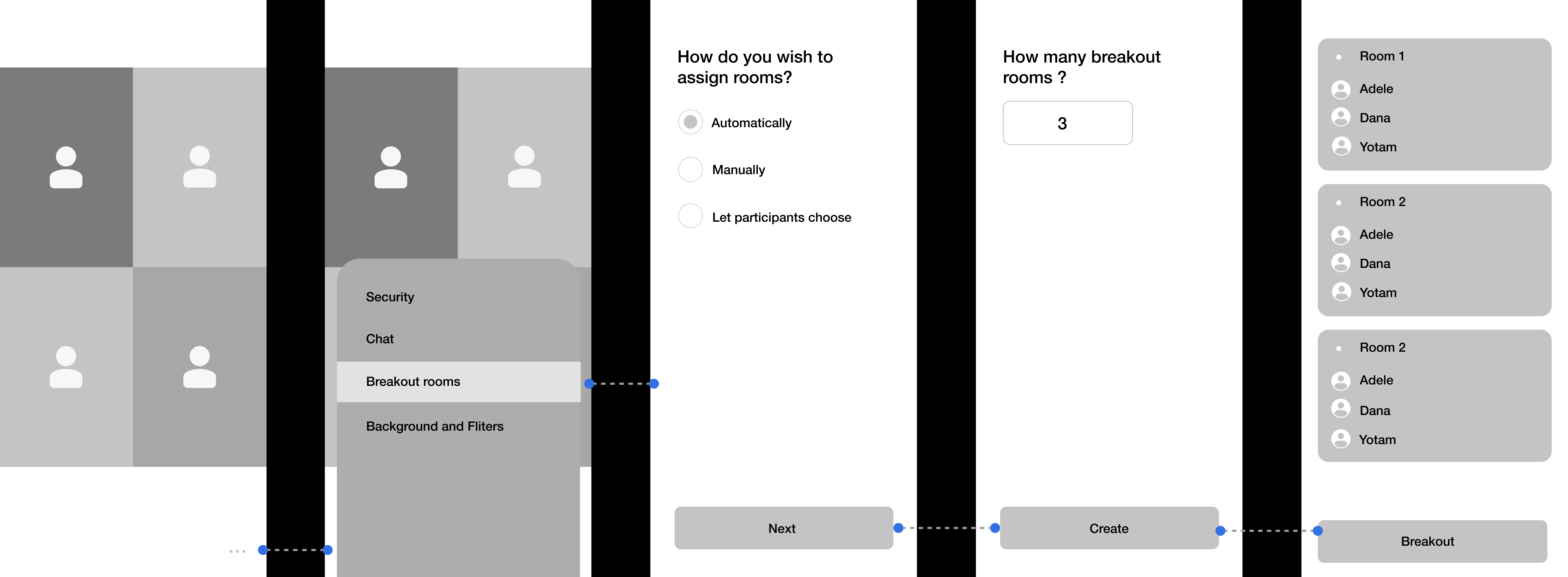
USER FLOW
![]()
CUE TO THE FEATURE
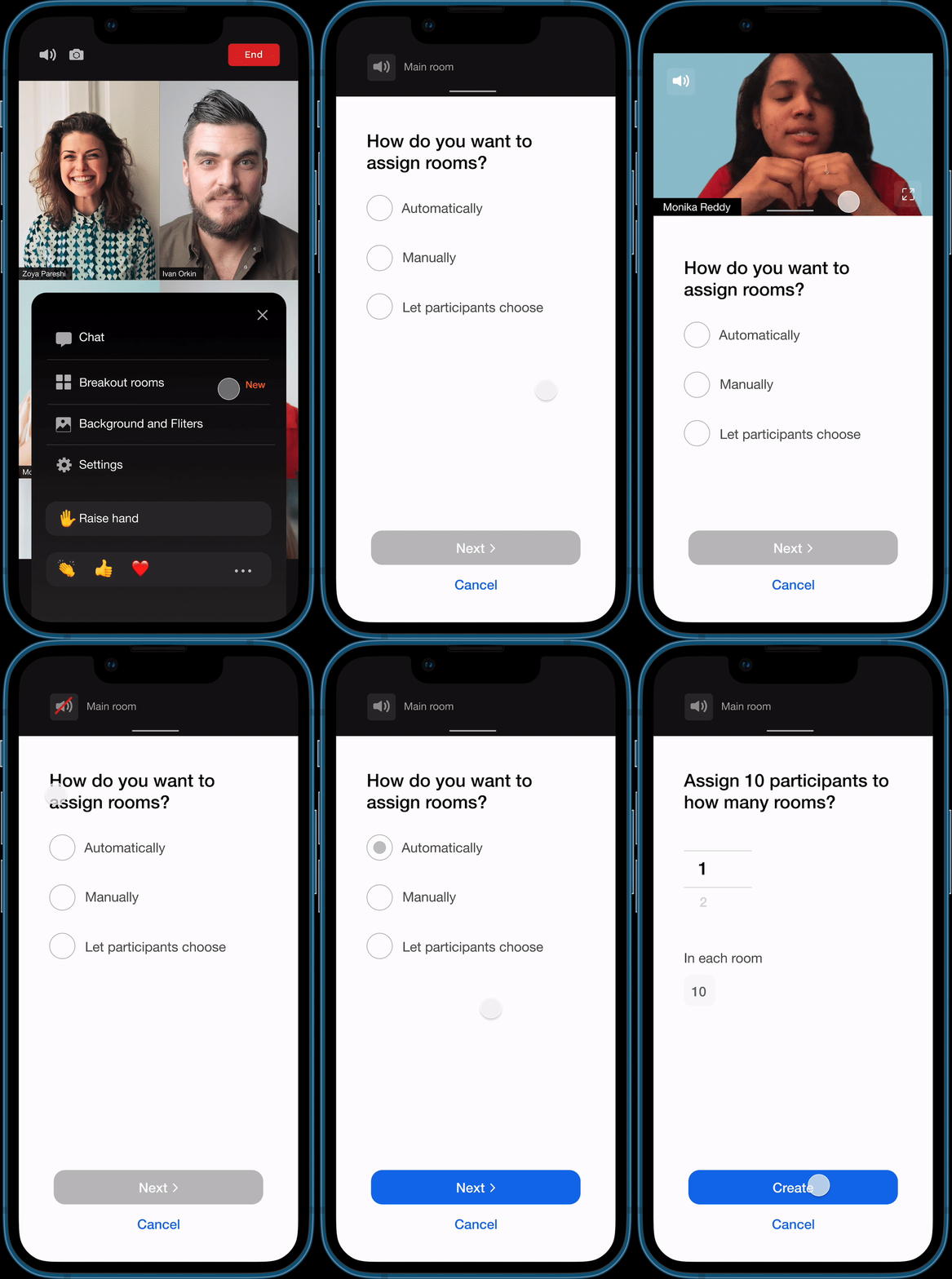
I built the feature into the existing Zoom navigation. Since there were key functions on the bottom navigation bar, I included the breakout rooms in the “more” tab and to make sure the user knows about this new addition, designed a Feature alert that slides into the screen and back.
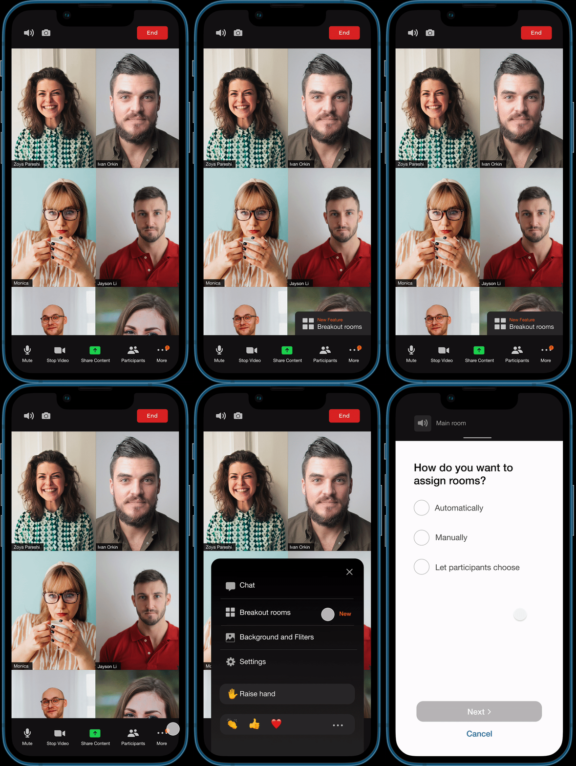
ACCESS TO THE MAIN MEETING
User creating the breakout rooms would still want to be present in the main meeting. Instead of minimizing the main meeting video, I chose to reduce it to a draggable top bar, so it doesn’t interrupt with the process of creating breakout rooms.
The audio from the main meeting will be ON by default and the user can choose to switch it OFF, if needed.
THE BREAKDOWN
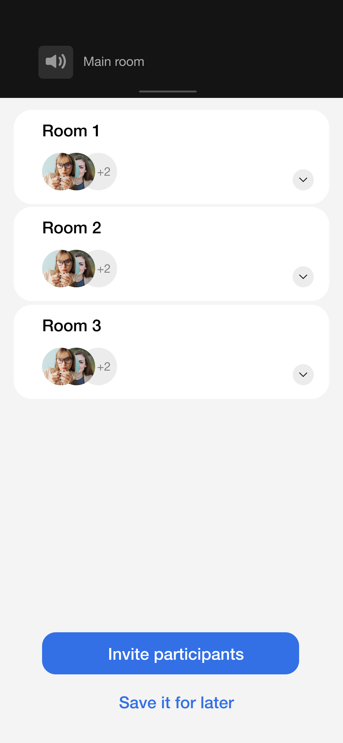
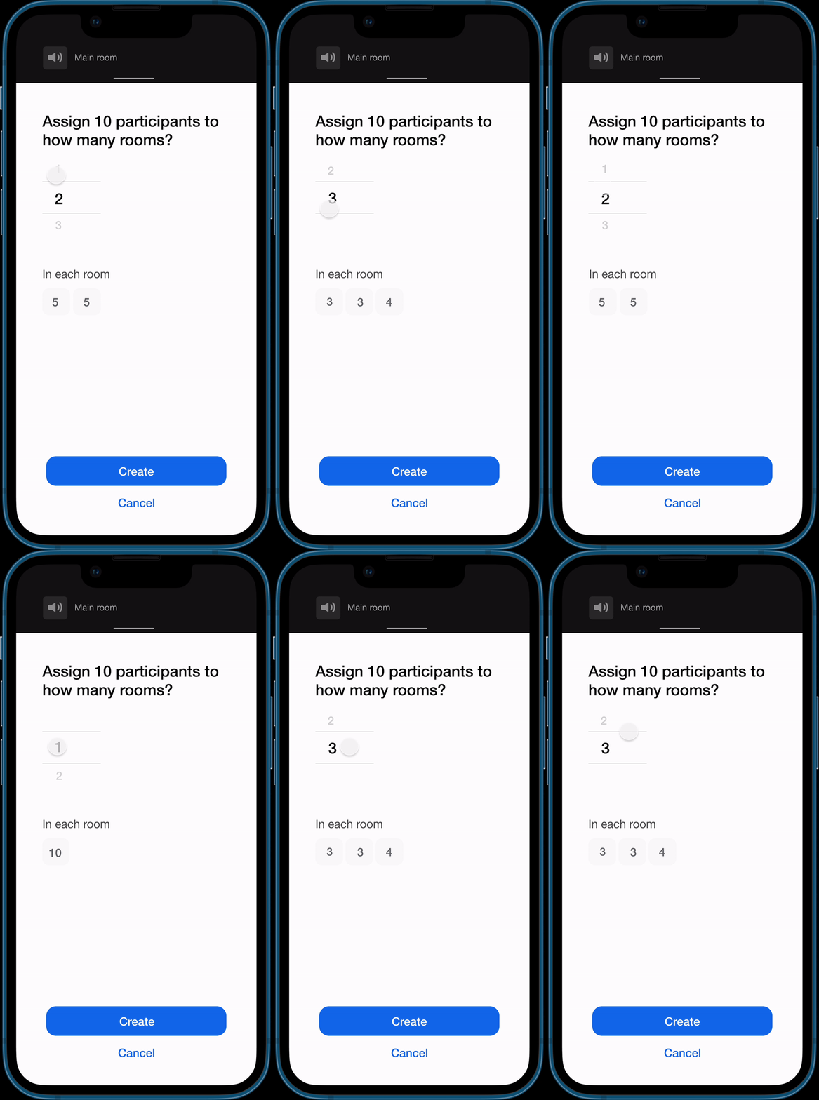
While assigning breakout rooms using an alogorithm, users wished they knew how many particpants would be in each room, so they feel they are aware and in control of the situation.
A simple scroll allows users to increase the number of rooms and a visual breakdown below give more information.
LET’S REPLACE THE CIRCULAR LOADER, SHALL WE?
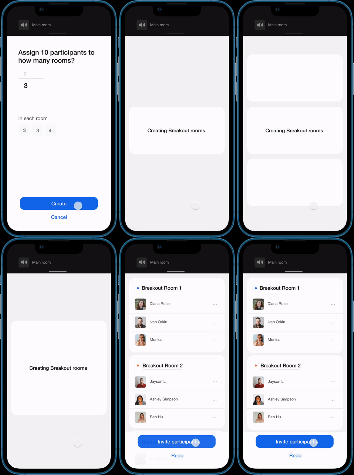
A loading circle to visually engage the user while the backend gets ready seems to be the Universal loading experience today. Nothing wrong with that! But, when we can Design a loading loop that gives them a preview of the content coming up, it can make the whole experience very intuitive.
INVITING PARTICIPANTS AND BACK TO MAIN ROOM
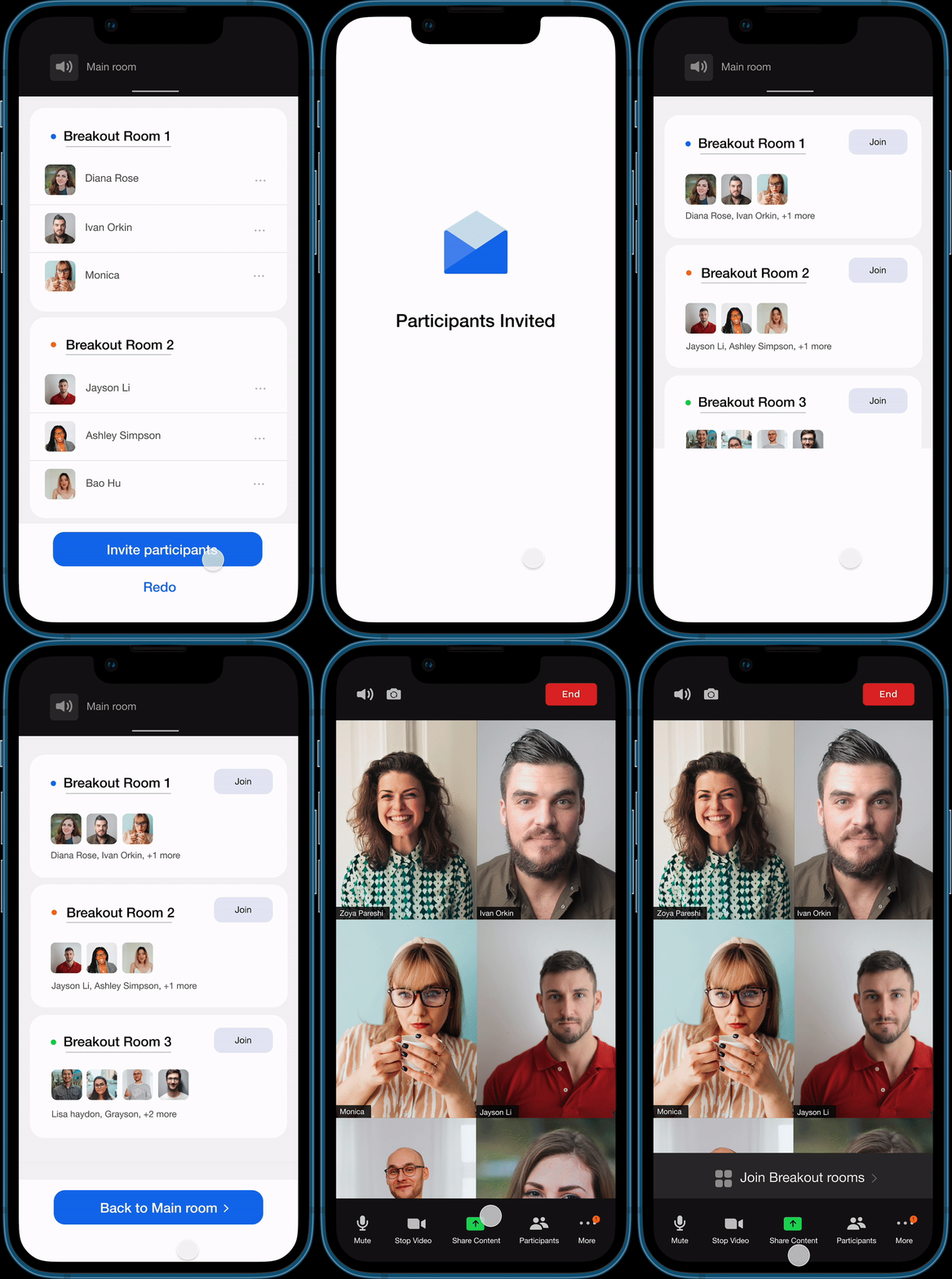
After creating the breakout rooms, the user can invite the participants and will have two options ~ either to join any of the rooms or to go back to the main room and join the breakout rooms later.
EDGE CASES AND EXPLORATIONS
This was a weekend project where I wanted to put more focus on prototyping, hence I chose to focus on just one user flow. There can be cases where the user wants to shuffle the participants in breakout rooms, or switch them with other members. It was a conscious choice to stick with one flow and prototype it well. Below are some edge cases that I mocked up as part of the ideation process.
FOR LARGER PARTIES ~
Teachers in schools and eduational institutions are some of the ardent users of breakout rooms. A teacher I interviewed said, she’d sometimes see the same students ending up in the same breakout rooms and since the student group is more than 20, it is hard to manually adjust the arrangement.
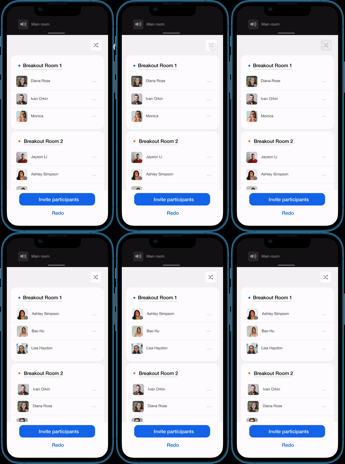
A Shuffle button on the top can help these users to just switch the arrangement in breakout rooms without too much trouble.
MOVE OR SWITCH PARTICIPANTS
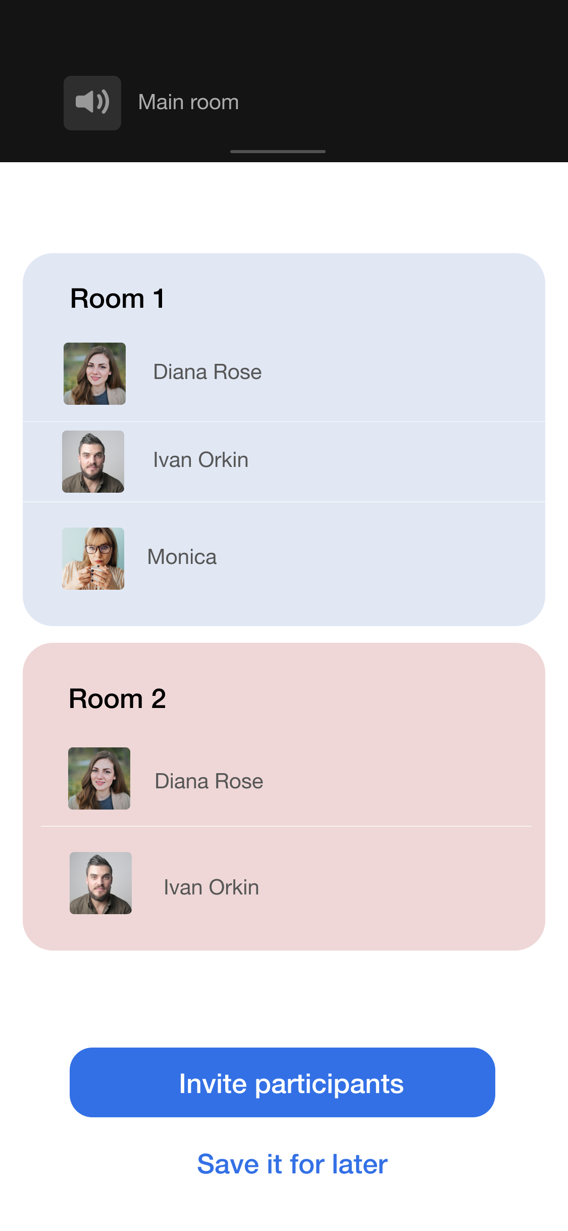
Users should be able to move around a single participant or switch two participants so they get the ideal arrangement.
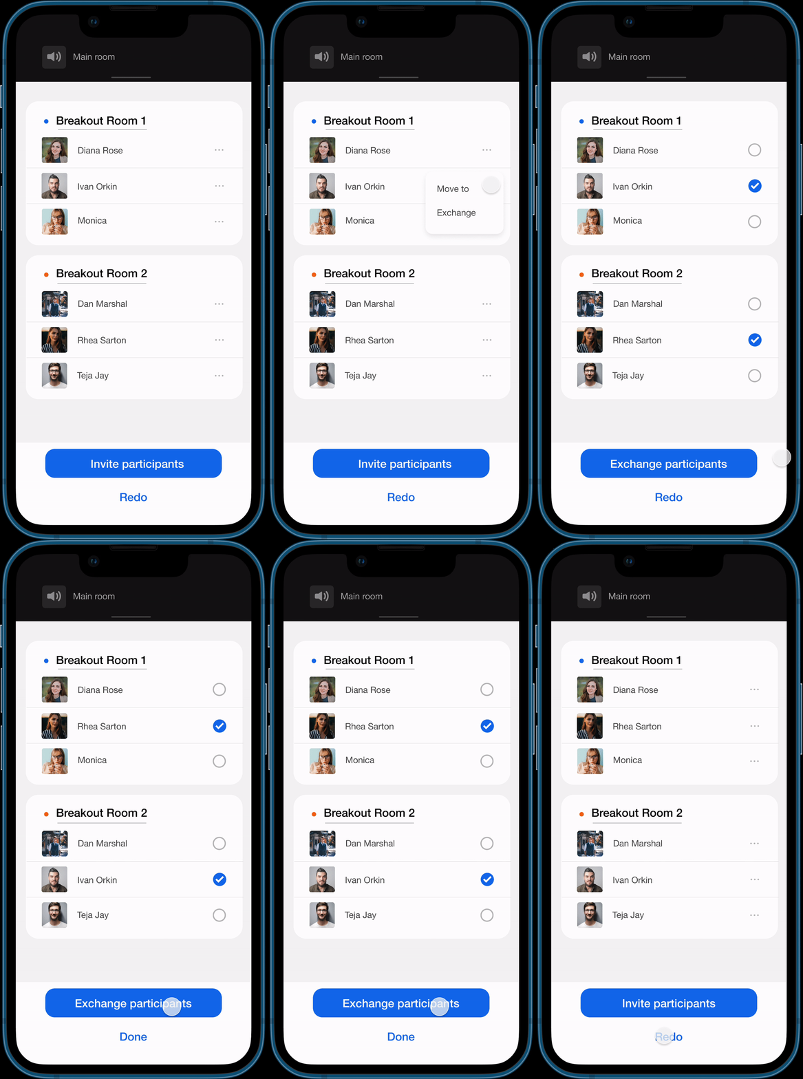
This is an insight generated from user interviews with an IT Managers and a HR consultant, both of them agreed how they make two introverted candidates don’t end up in the same breakout room.
DESIGN DECISIONS INFLUENCED BY TESTING
I tested some versions of the clickable prototype using Figma Mirror Mobile app, with users who also participarted in User Interviews. Especially new interactions that seem good in the head, become complicated once designed. One such example is here ~
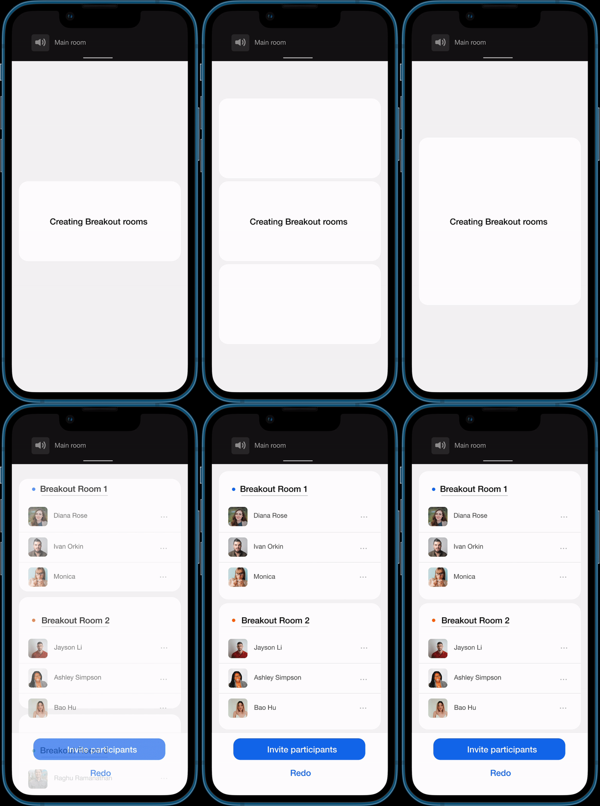
︎ Failed version of Loading loop
Designed this interaction to load the content as a wireframe, but it’s just too much information for a user. A loading loop needs to be simple, repetitive and weirdly therapeutic
Designed this interaction to load the content as a wireframe, but it’s just too much information for a user. A loading loop needs to be simple, repetitive and weirdly therapeutic
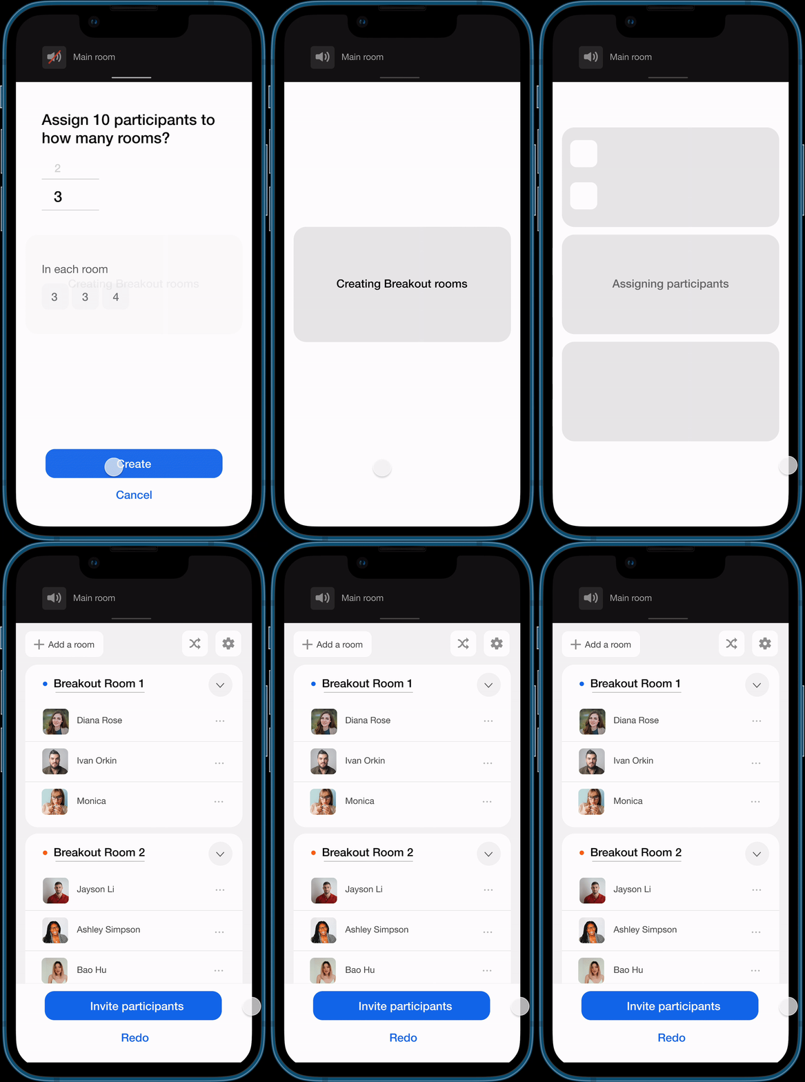
︎ Successful version of loading loop
A simpler loop that solved the issue + that visually tells the user that participants are being divided into rooms.
A simpler loop that solved the issue + that visually tells the user that participants are being divided into rooms.
FAILED UI ITERATIONS

