A CAMPUS APP FOR STUDENTS TO FIND AND CONNECT TO MENTORS, WITH A UI THAT REFLECTS THE FUN/CREATIVE SPIRIT OF THE ART COLLEGE.
Started as a Design exercise that’s part of Google’s interview process, the idea of designing userflows to find mentors for my Design college (MICA), provided the right opportunity to try my weird type-nerd fantasy of using multiple display typefaces within one screen, without affecting the user flow and functionality.
ROLE
Defining project scope, Mapping Timeline and Strategy, Building Constraints to make achievable targets
User Research, Typography, User Flows, Wireframing, Prototyping, User Testing
Defining project scope, Mapping Timeline and Strategy, Building Constraints to make achievable targets
User Research, Typography, User Flows, Wireframing, Prototyping, User Testing
DURATION
6 months
TEAM
Self-initiated and solely executed proof-of-concept
6 months
TEAM
Self-initiated and solely executed proof-of-concept
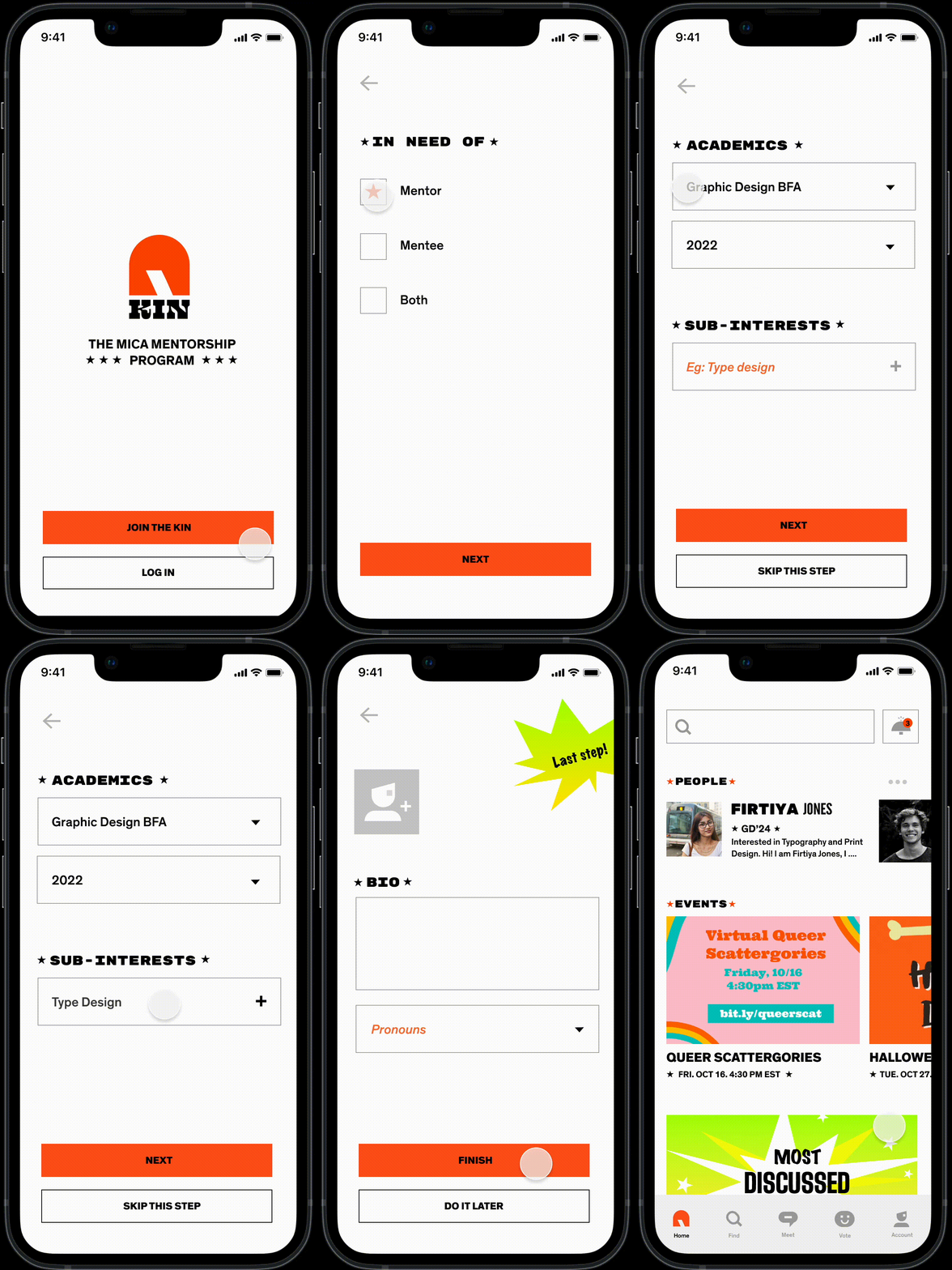
ONBOARDING
Every student has a unique ID and password to log into the campus portal and the same could be used for the app, to avoid multiple credentials and confusion.
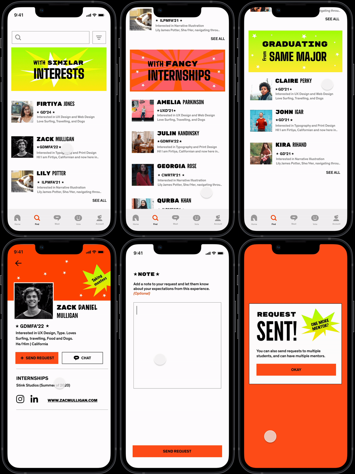
FINDING A MENTOR, SENDING REQUEST
Buckets that make searching easier. Research has informed that students love choosing on mentors multiple factors. Thus, the categorization.
“I’d like to know their interests and what kind of a person they are, before actually deciding on them as a mentor or mentee”
- Claudia, First year, GDMA
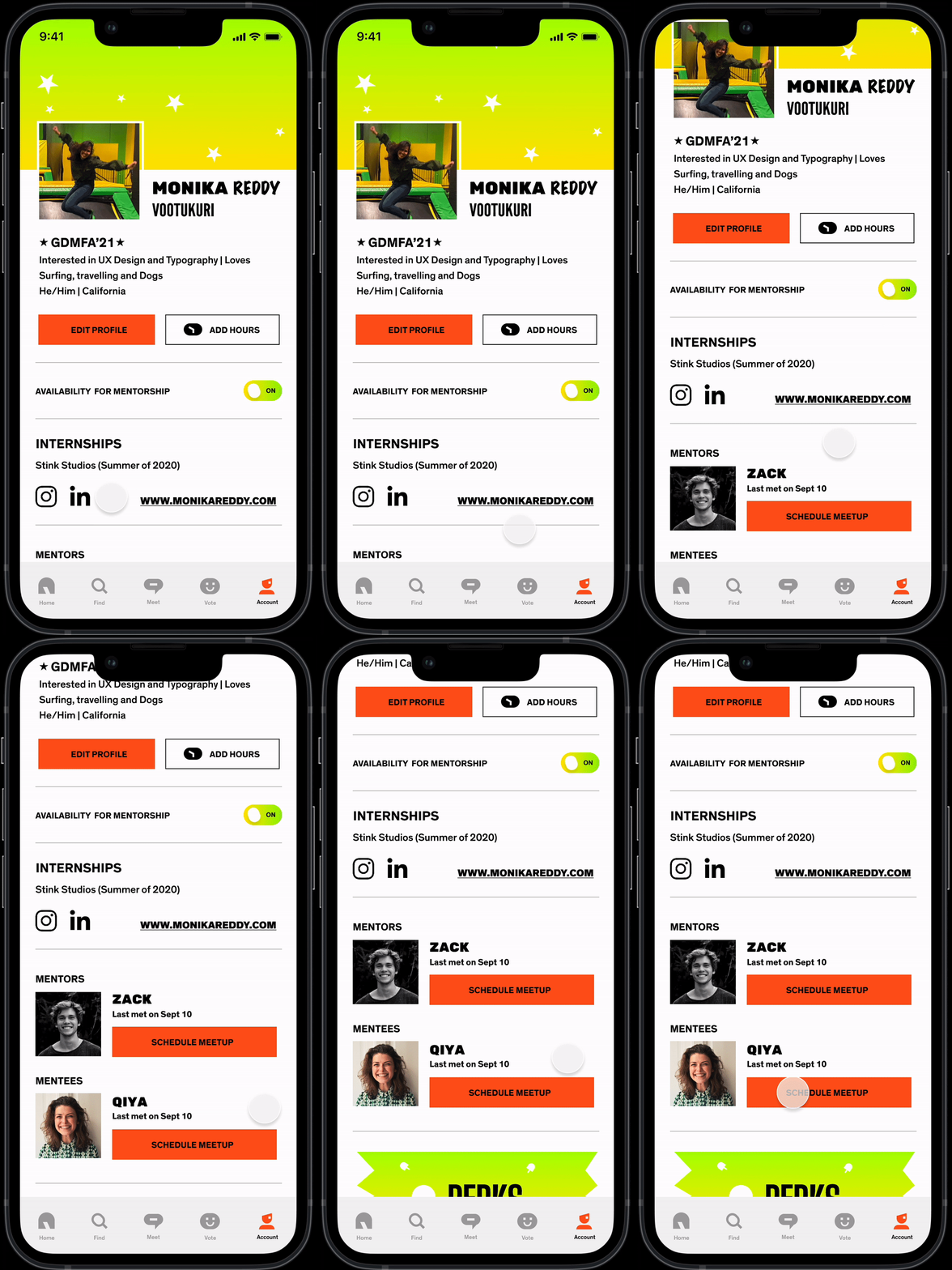
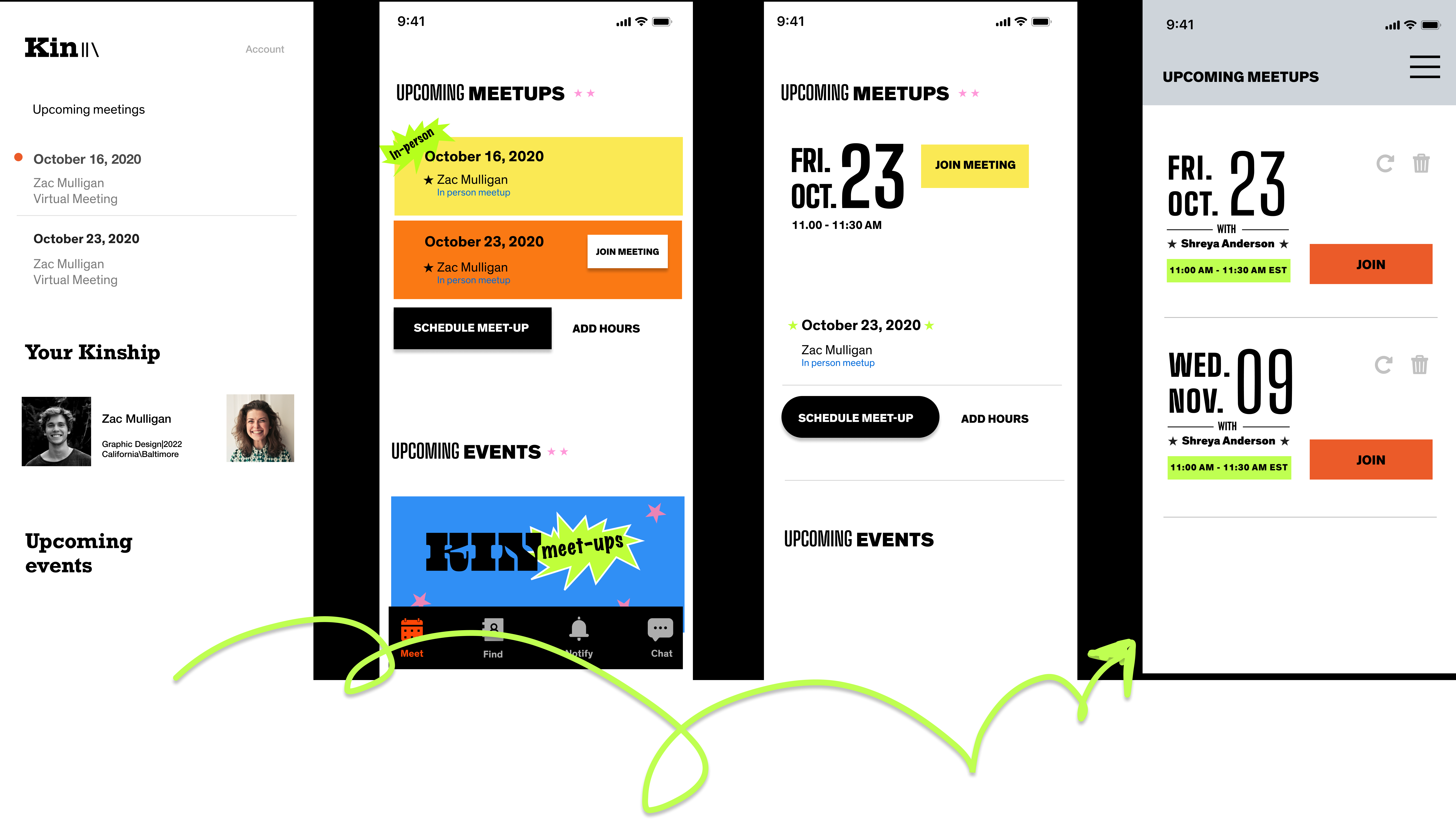
SCHEDULING A MEET-UP WITH A MENTOR
Calendar system to prevent back and forth in scheduling. Students can book a meeting with their mentors, directly by selecting one of the available slots in their calendar.
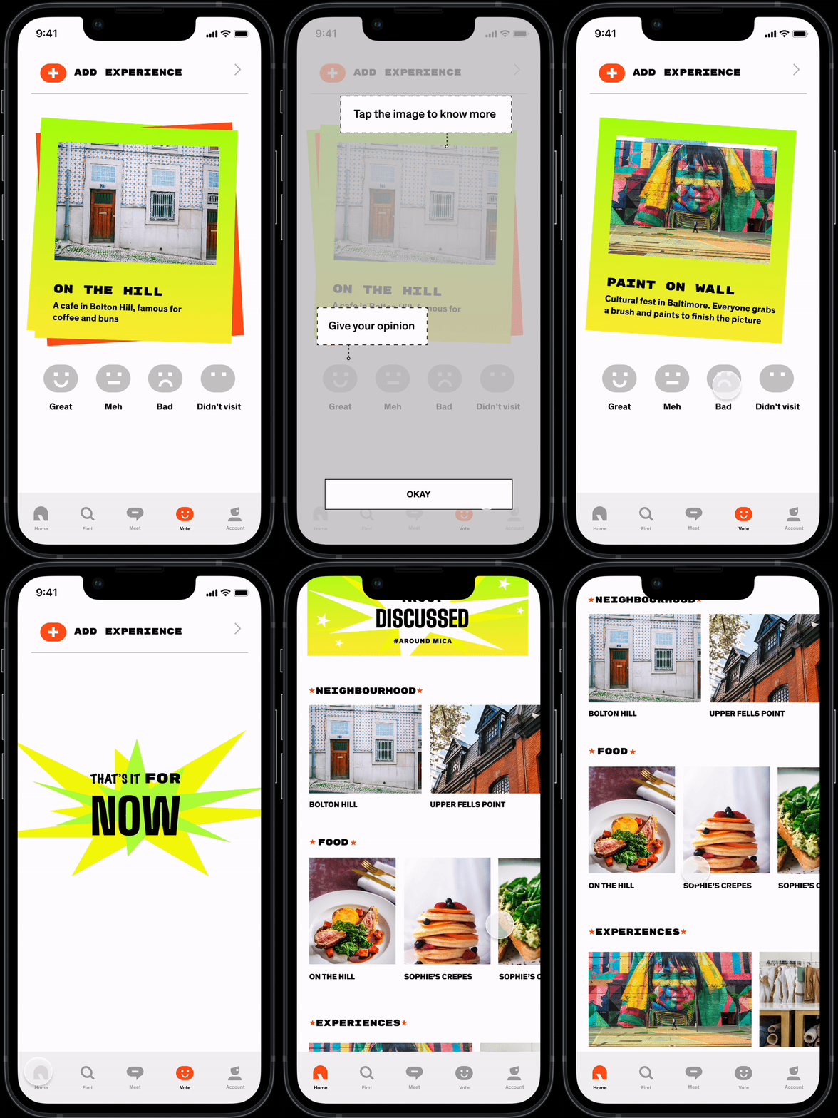
MENTORING BY RATING PLACES
Any student with experience can give their opinion. These opinions will later be used to provide feed on the home screen.
“The more the mentors, the merrier! For small suggestions, I used to run to my seniors, asking where to go for Sushi, groceries etc!”
- Isabelle, transfer student, GD
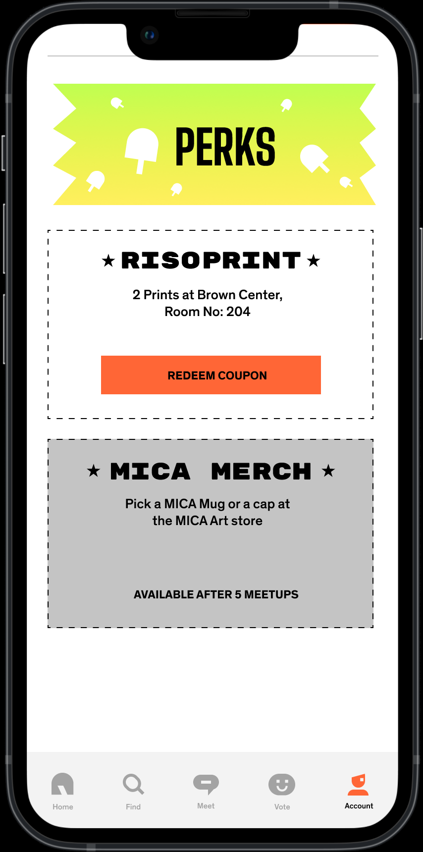
PERKS OF RISOPRINTS AND MICA MERCH
Mentors get free Risoprints and Mica Merchandise for the hours they put in for mentoring other students. These perks can be found and unlocked in the profile section.
BUT, DO USERS REALLY WANT SUCH A BOUTIQUE APP?
User Research says YES!
- A Google questionnaire was sent to 25 students, a mix of undergraduate and graduate students to collect quantifiable data.
- 5 in-depth interviews were conducted for qualitative answers
The Research insights were clear that students found the current app of the college boring, and not reflective of the physical space.
“THE APP IS WAY TOO BORING FOR A DESIGN COLLEGE”
Katie Monroe, second year
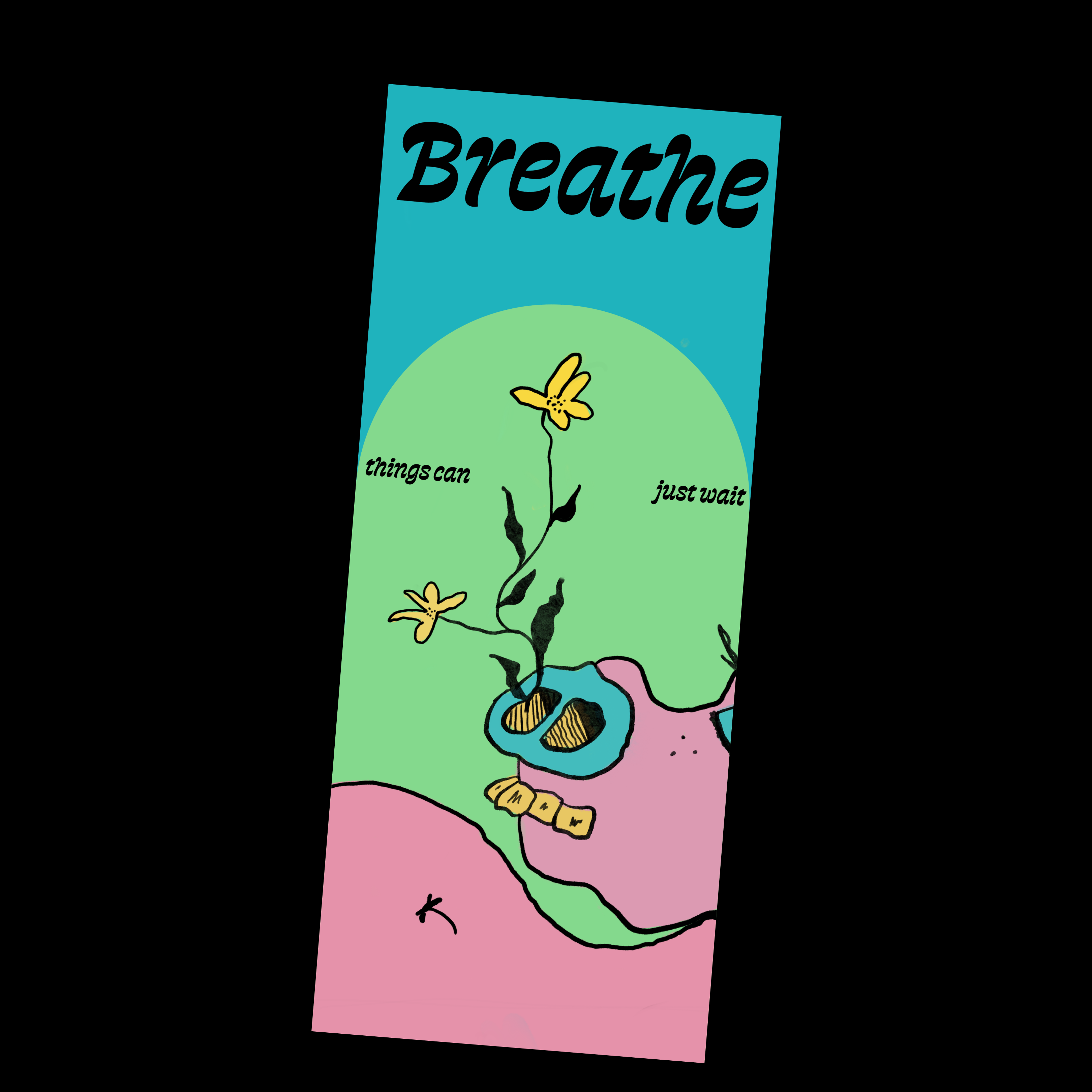
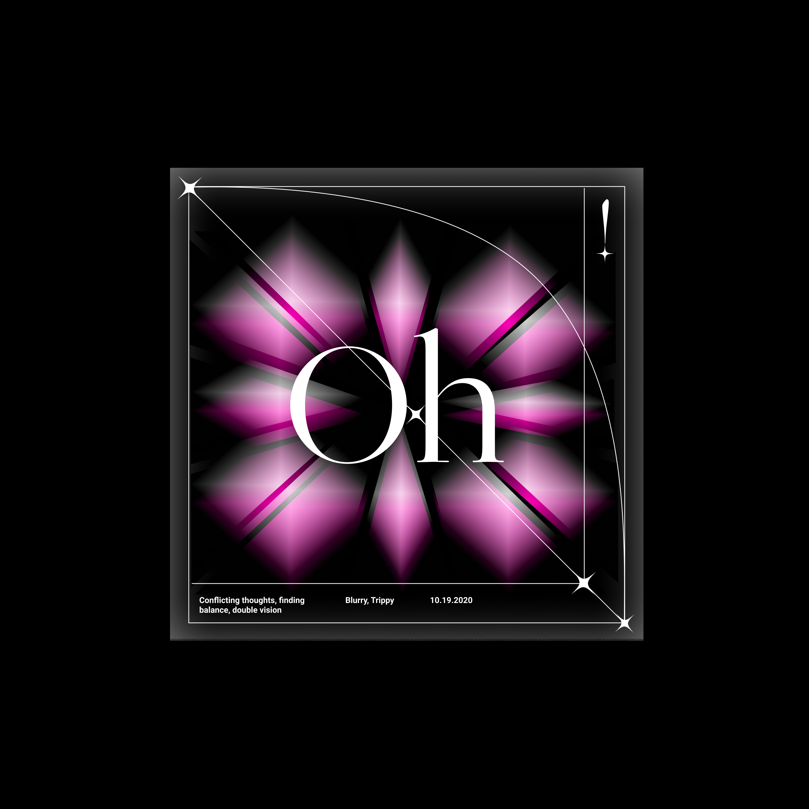
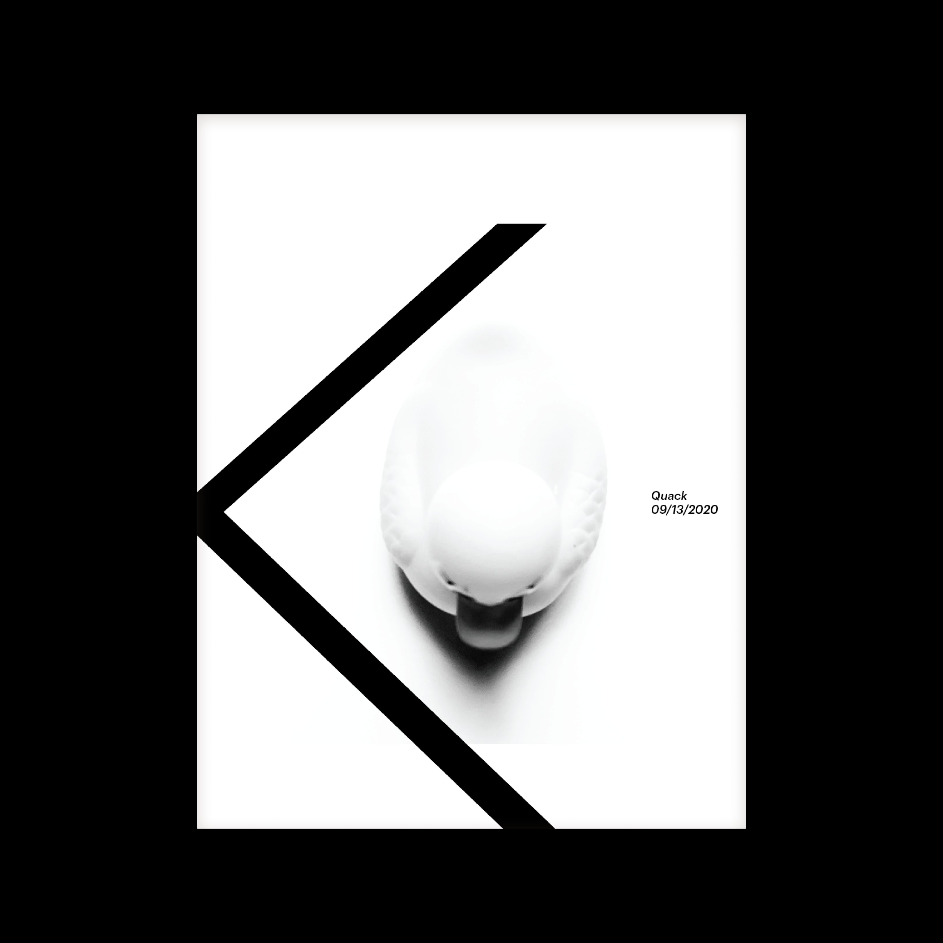
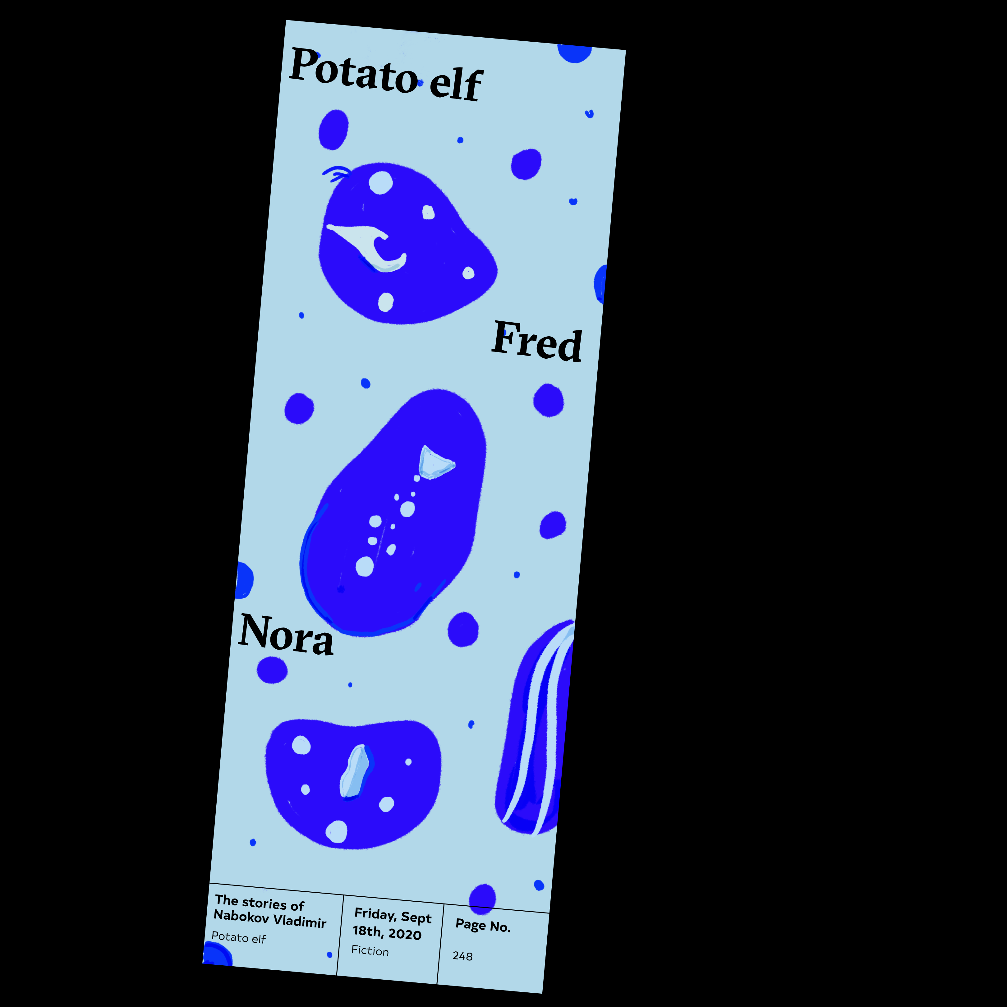
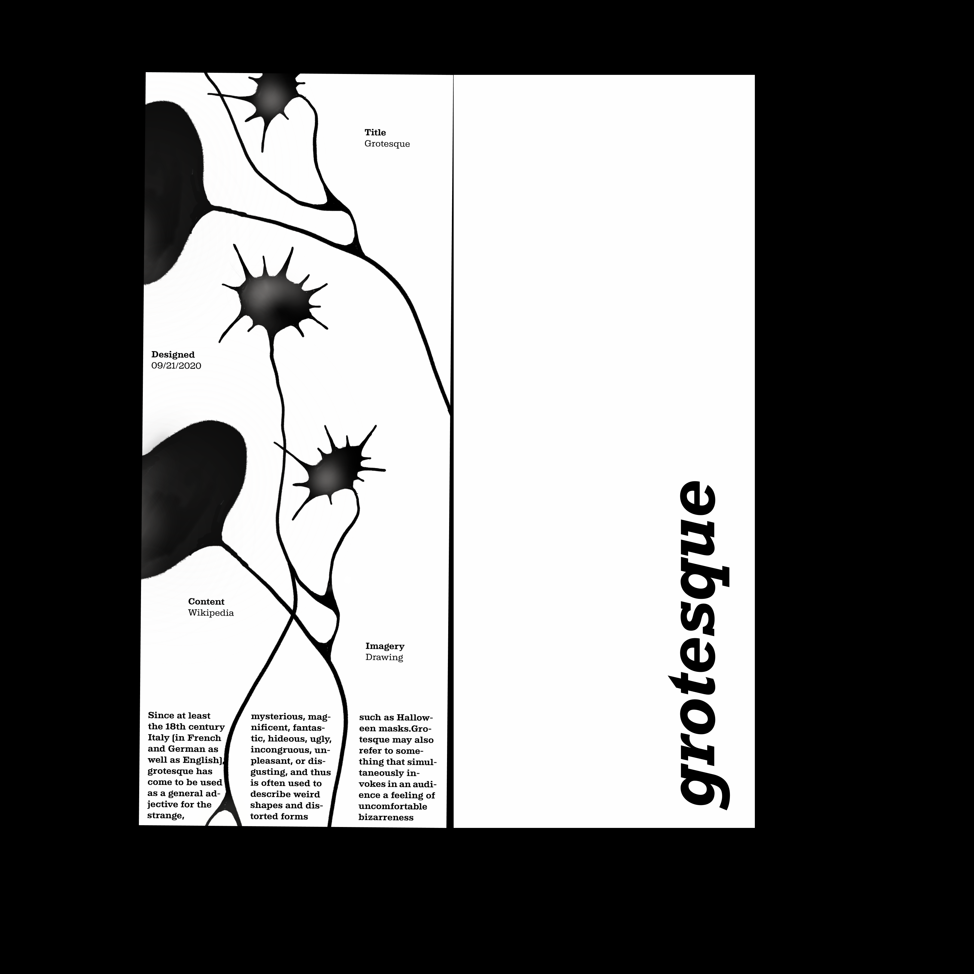
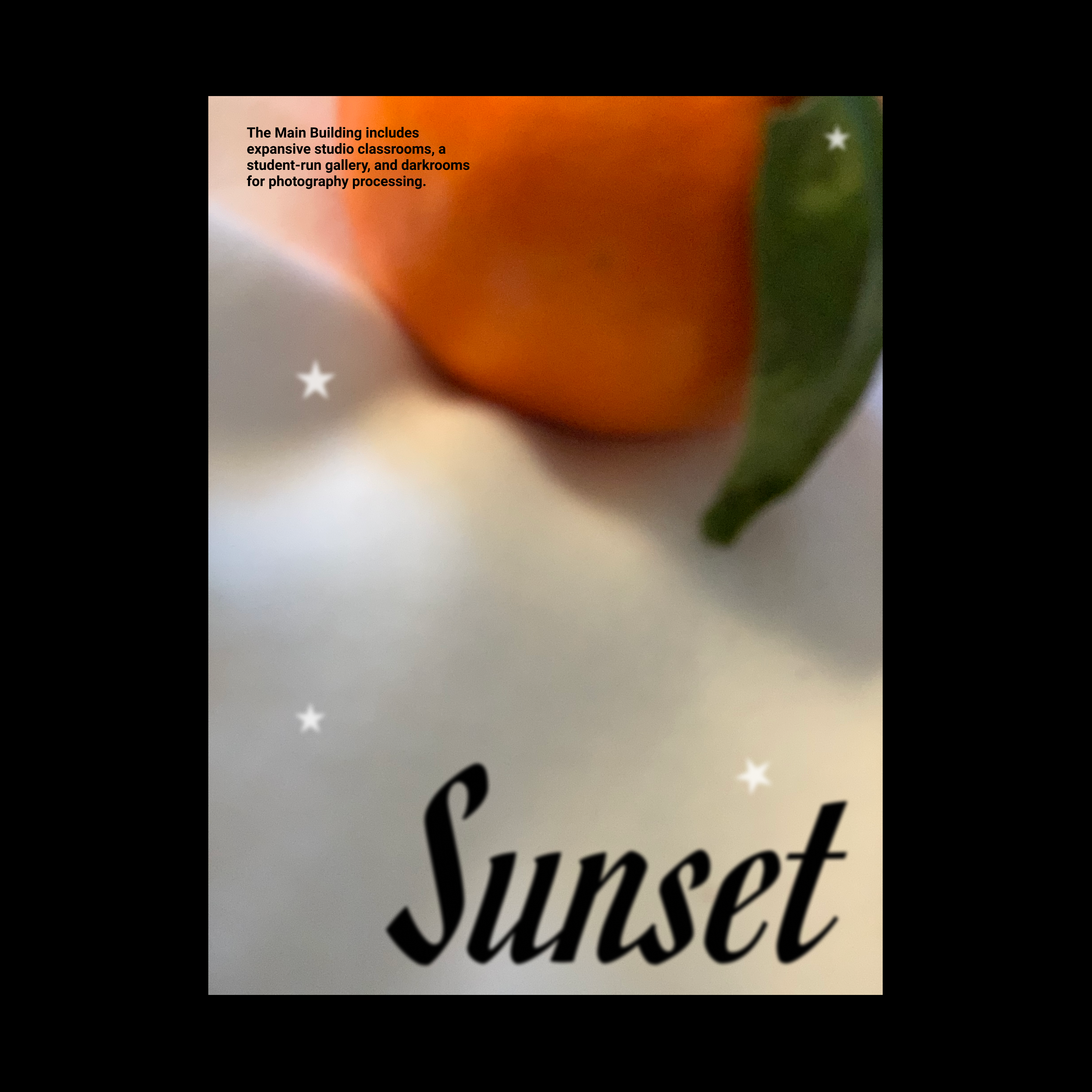
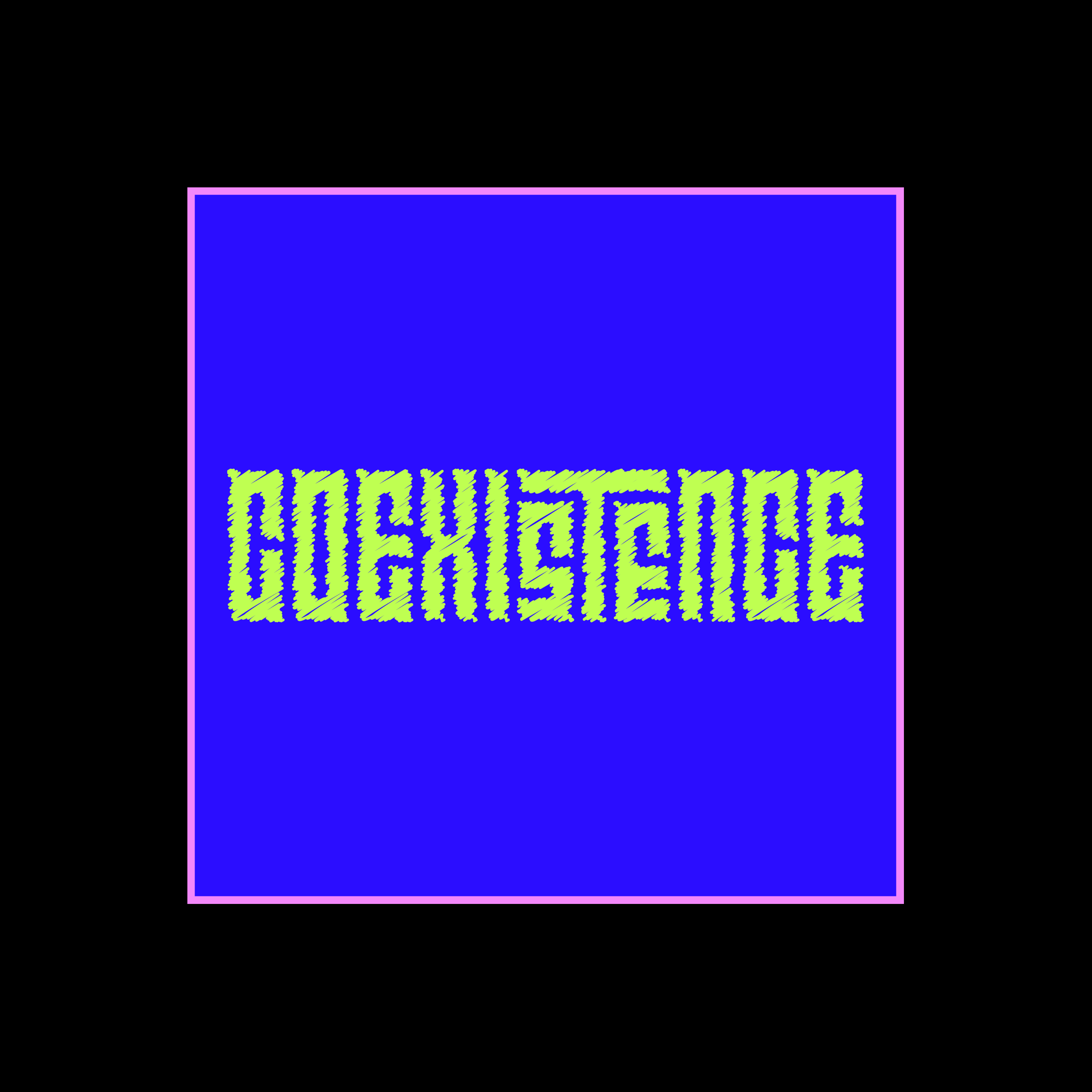
I funnelled the College posters into a User Interface, taking cues from the colors, imagery, patterns, and most importantly the type. Result is a Visual that looks like a poster, works like a screen ︎︎︎
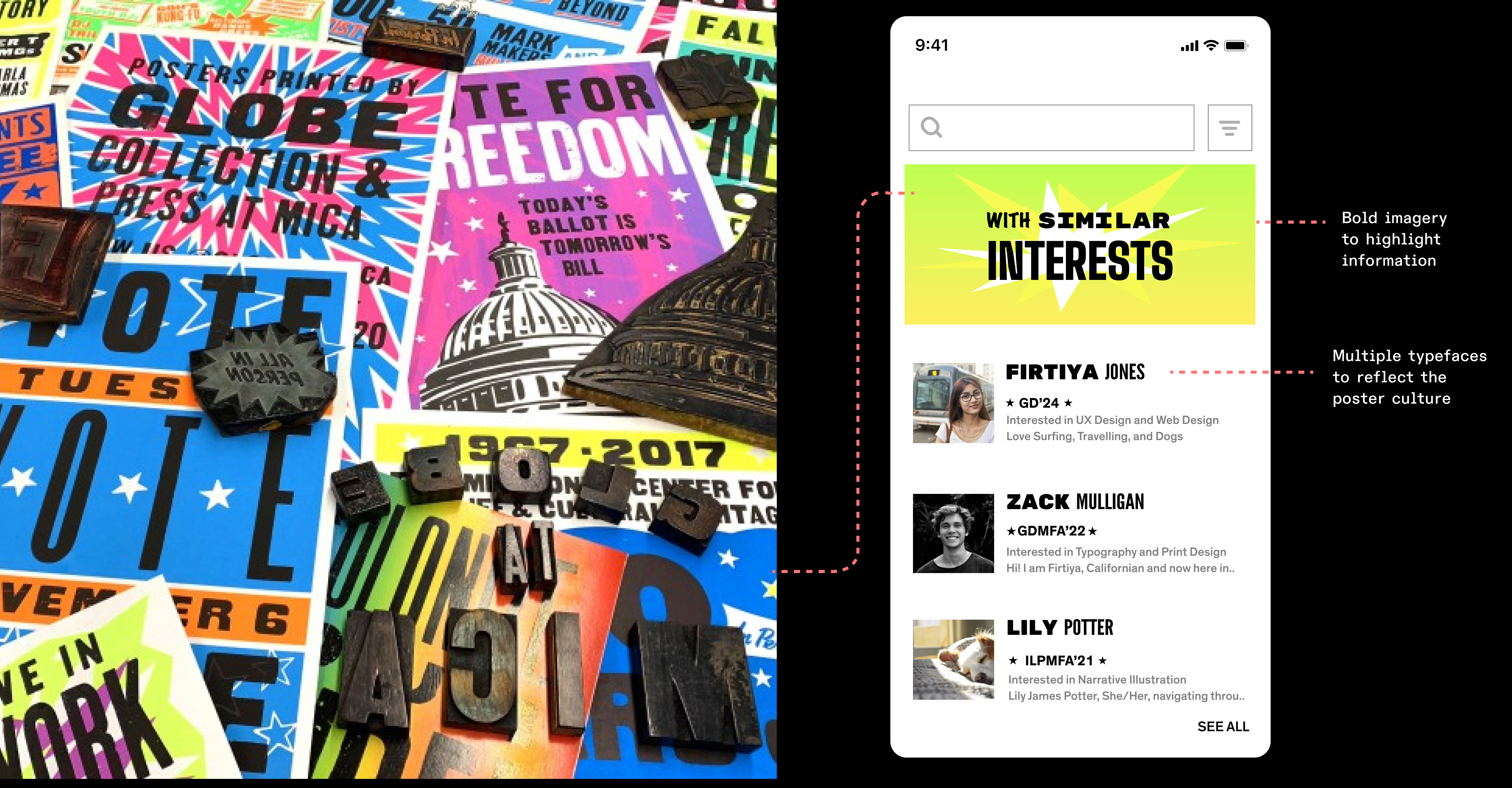
A lengthy process to find a middle ground between “too much color, too many typefaces” and “Okay, I understand the information!”
WHAT ABOUT LEGIBILITY OF SOME OF THESE FONTS?

Although I used multiple display typefaces, I made some choices to make sure these eccentric visual choices work in favour of the UI, highlighting information, adding weight to unmissable details and of course taking risks with the least important stuff.
BOLD TYPEFACE FOR THE UNMISSABLE FIRST NAME, RISKY CONDENSED TYPEFACE FOR AN ADDITIONAL DETAIL OF LAST NAME, STARS TO HIGHLIGHT THE PROGRAM AND YEAR.

