A GAME DESIGNED & LAUNCHED FOR KIDS WITH CEREBRAL PALSY.
Reaching out to the bubbles and touching the screen to pop them helps improving the physical mobility and body-mind coordination.RESOURCES ON WEB
🔗 National Library of Medicine;
🔗 Kennedy Kriger Institute;
IMPACT
💎️ The Redesign of this game saw an increase of the kids engagement level by 50%
(data tracked by PediCORE)
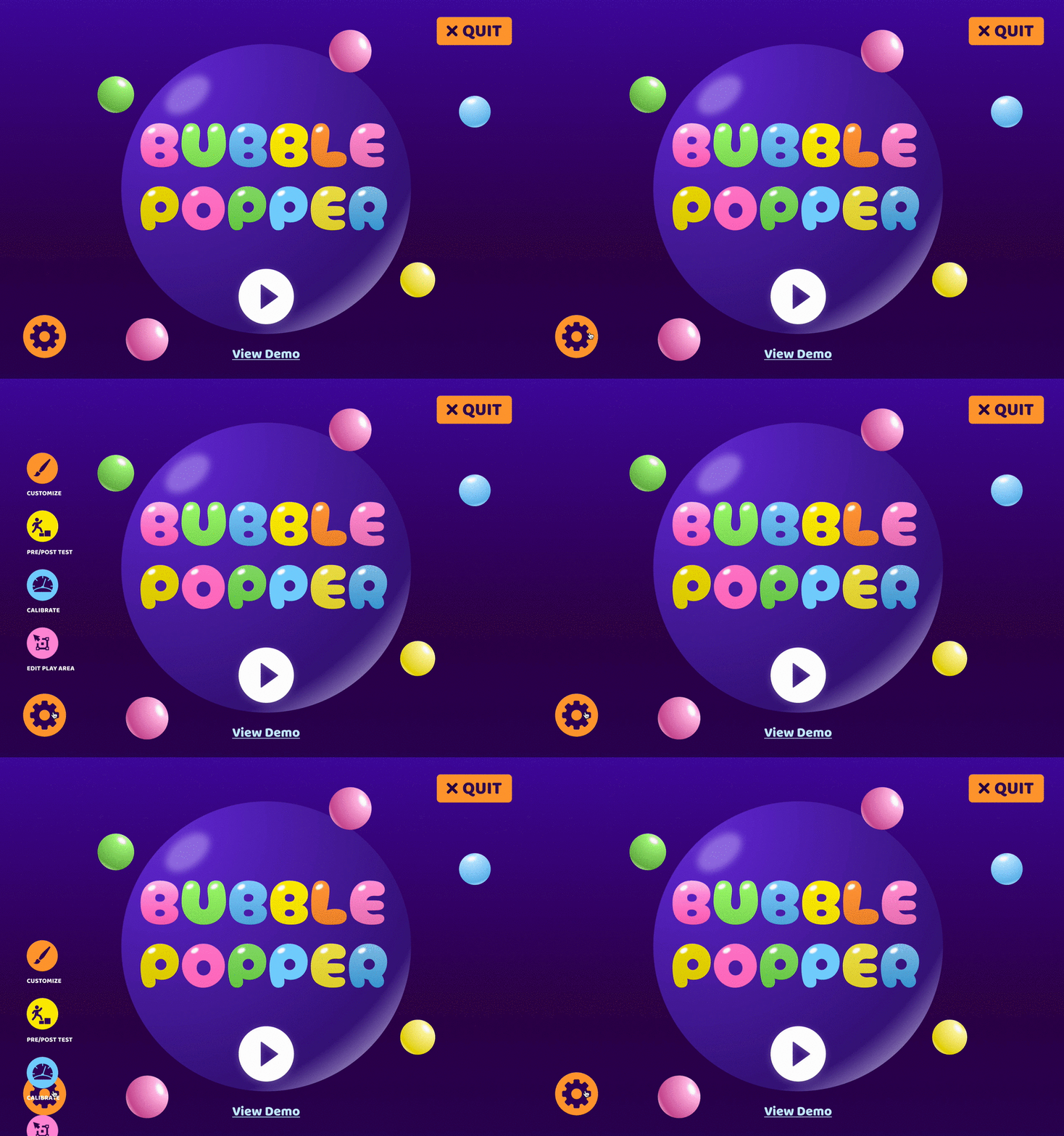
HOME SCREEN
Categorizing sub menus into the collapse menu to clear space and to improve focus.
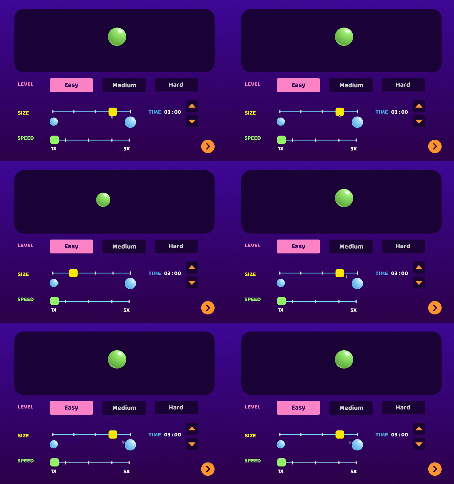
GAME SET-UP
A real time generator window to show the bubble accurately as the parameters change.
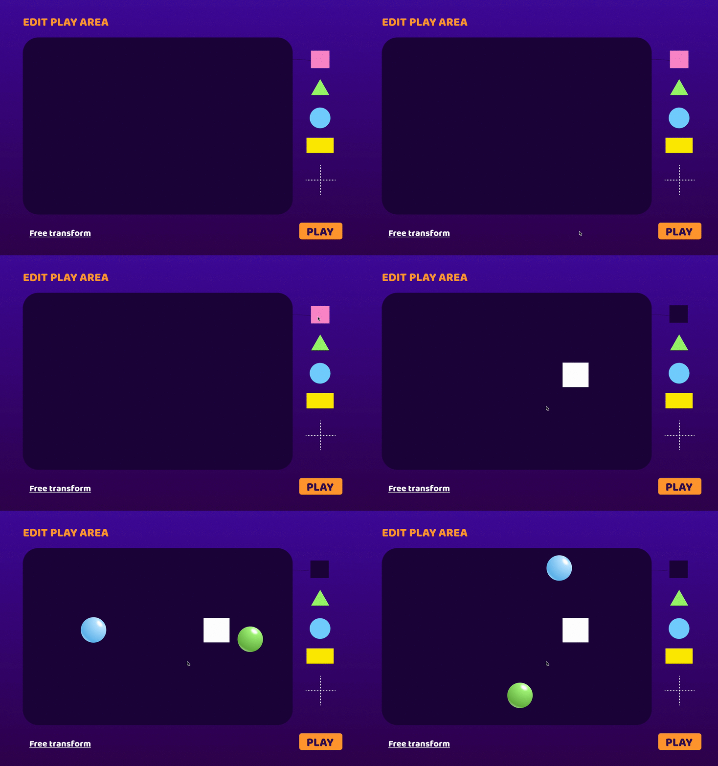
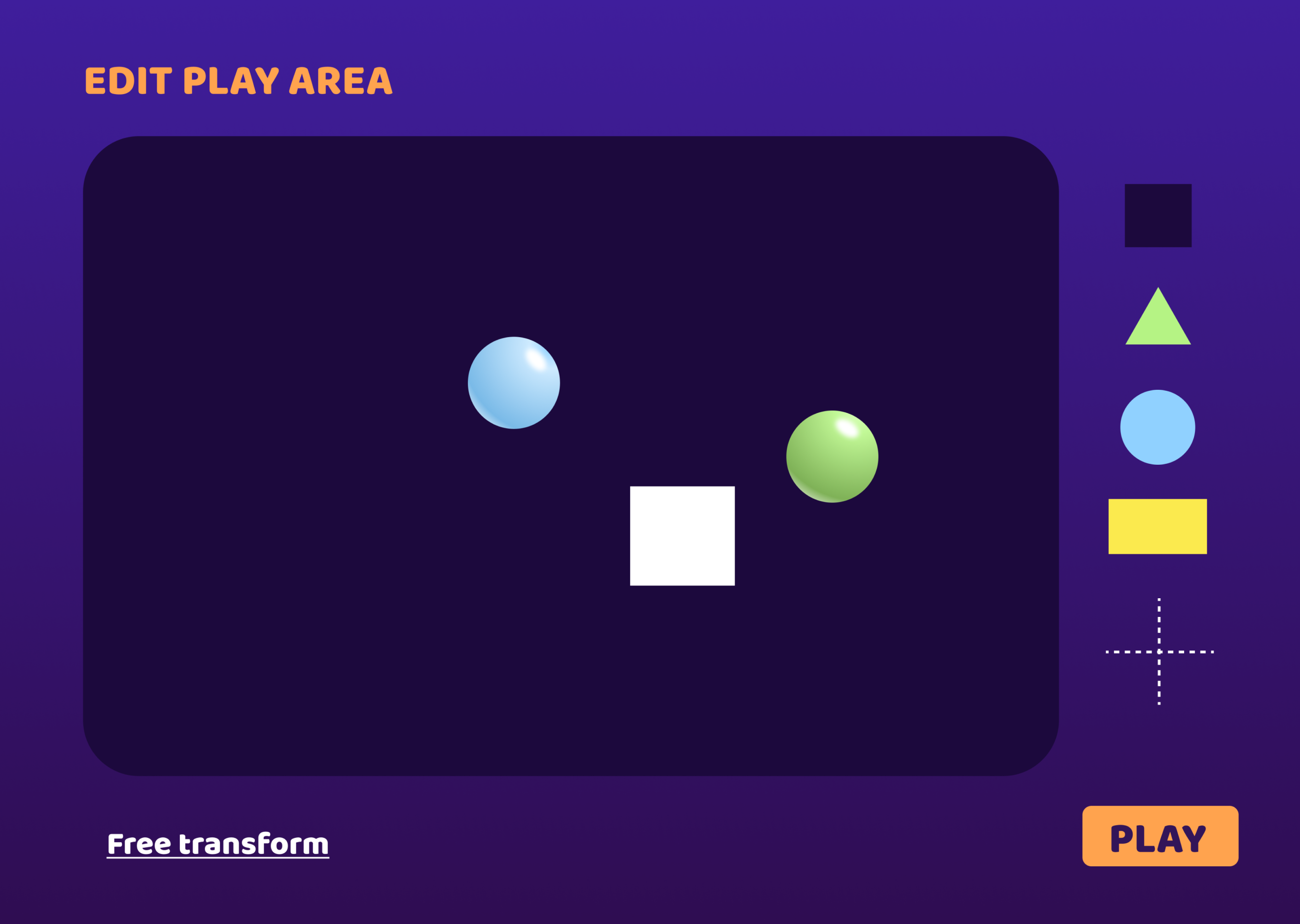
ADDING OBSTACLES TO INCREASE DIFFICULT LEVEL
Intuitive interactions to help Physical Therapists edit the play area by adding obstacles and grids.
OLD VS NEW DESIGNS︎︎︎
Grouping individual features/options to clear space and create focal points on the screen
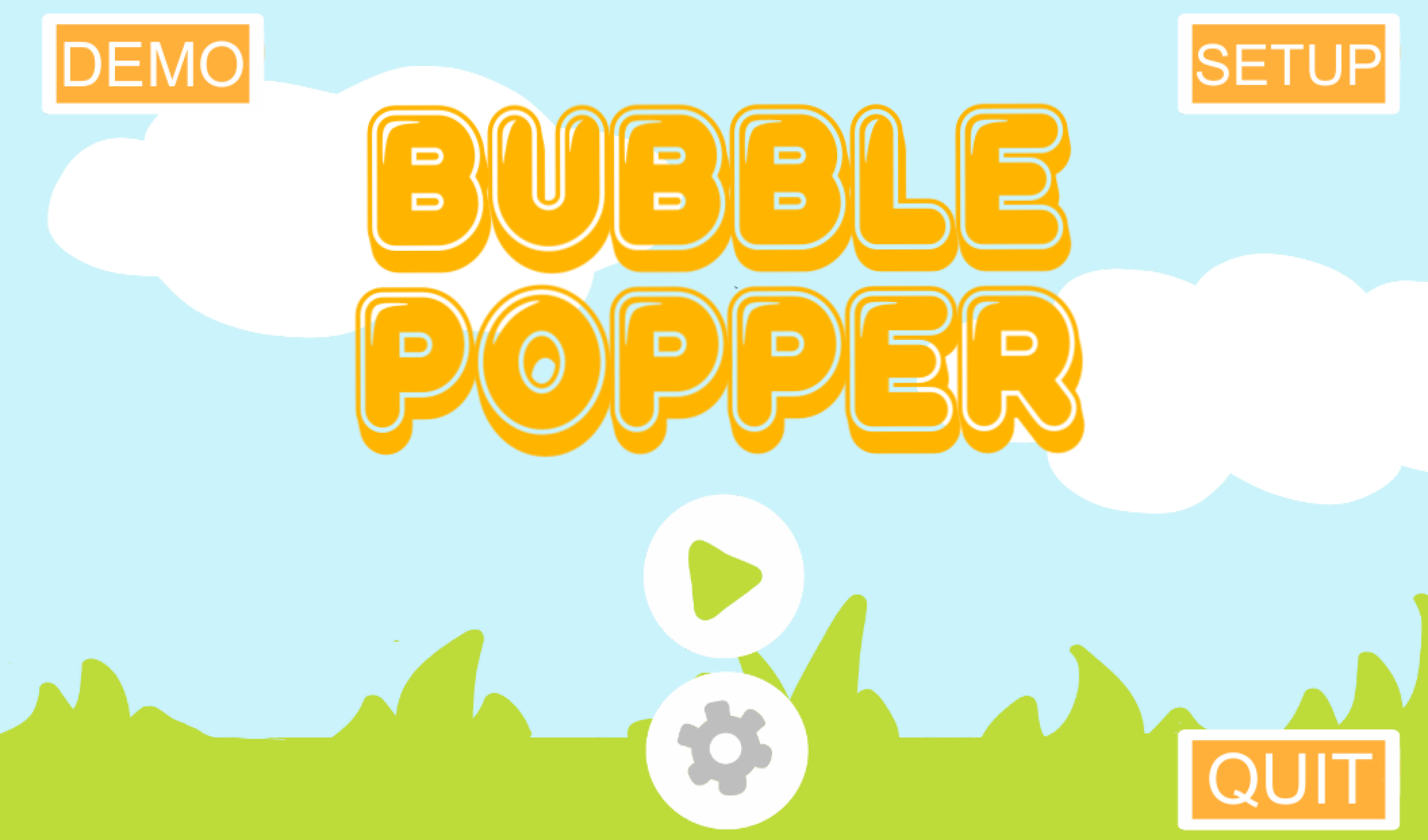
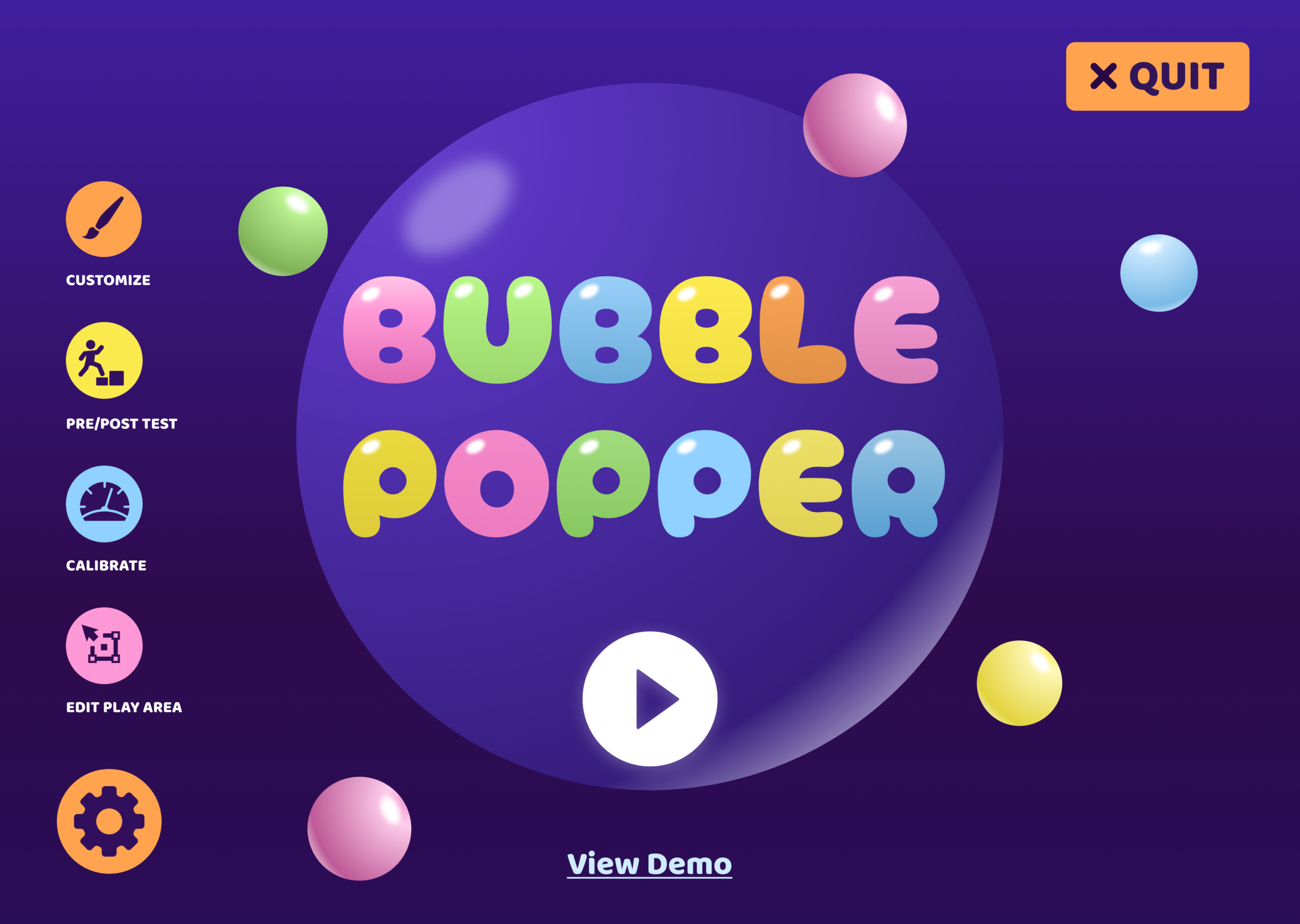
Grouping individual features/options to clear space and create focal points on the screen
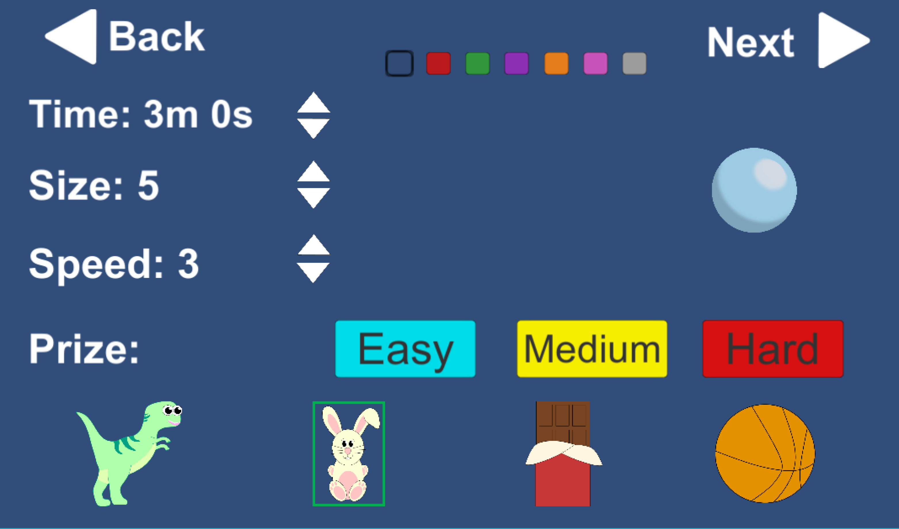
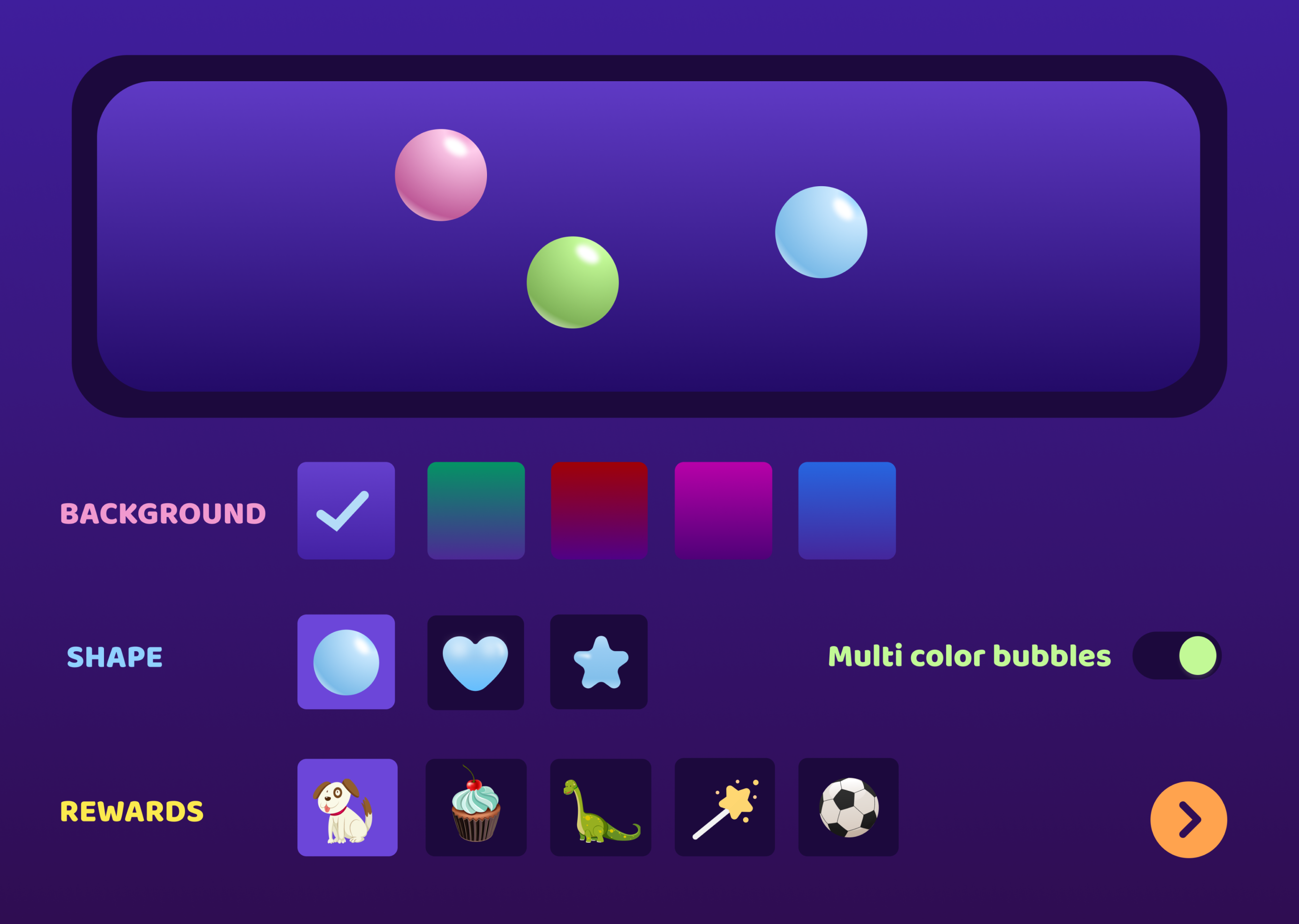

Switching Toggle for a simple Drag & Drop Interaction

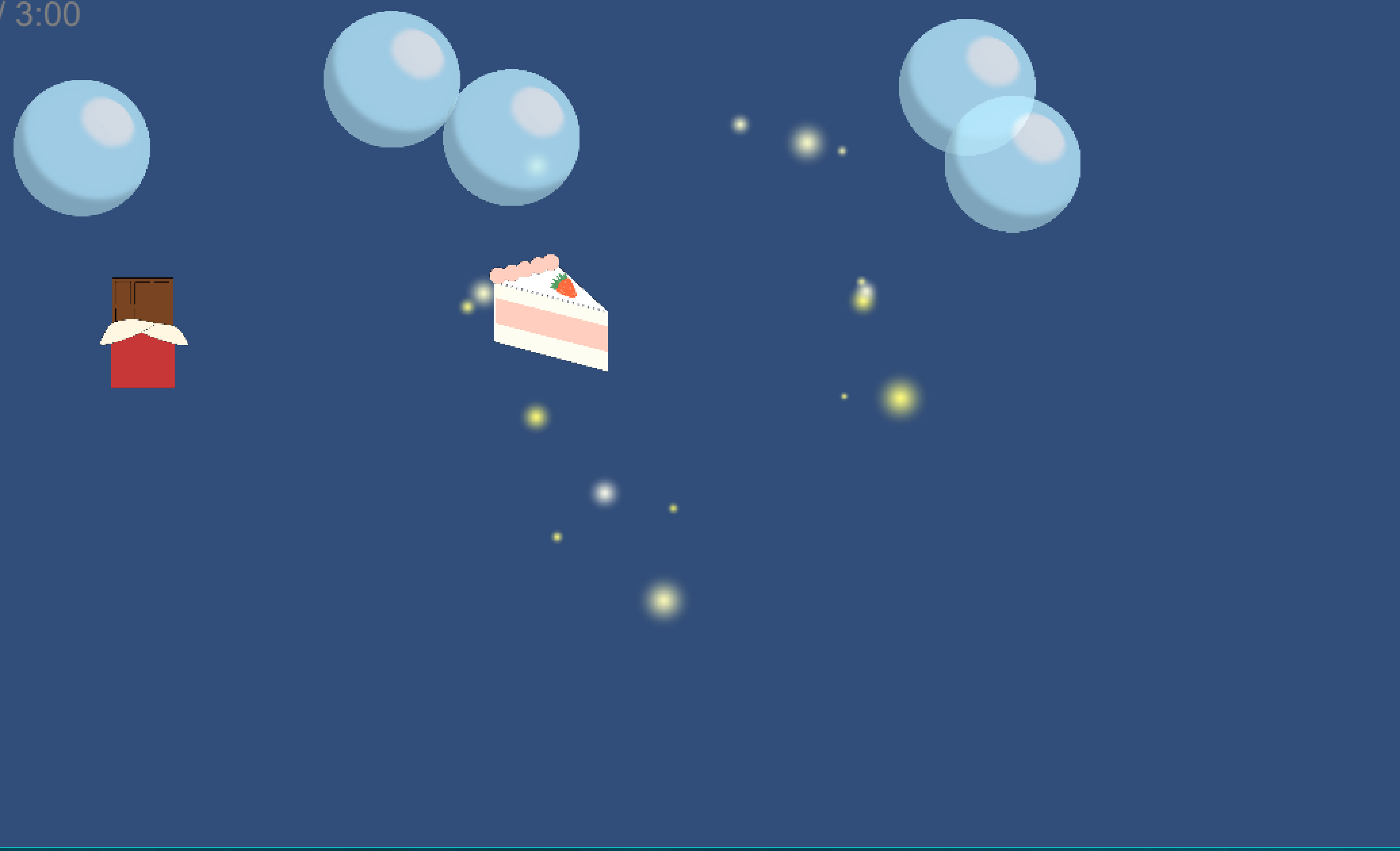
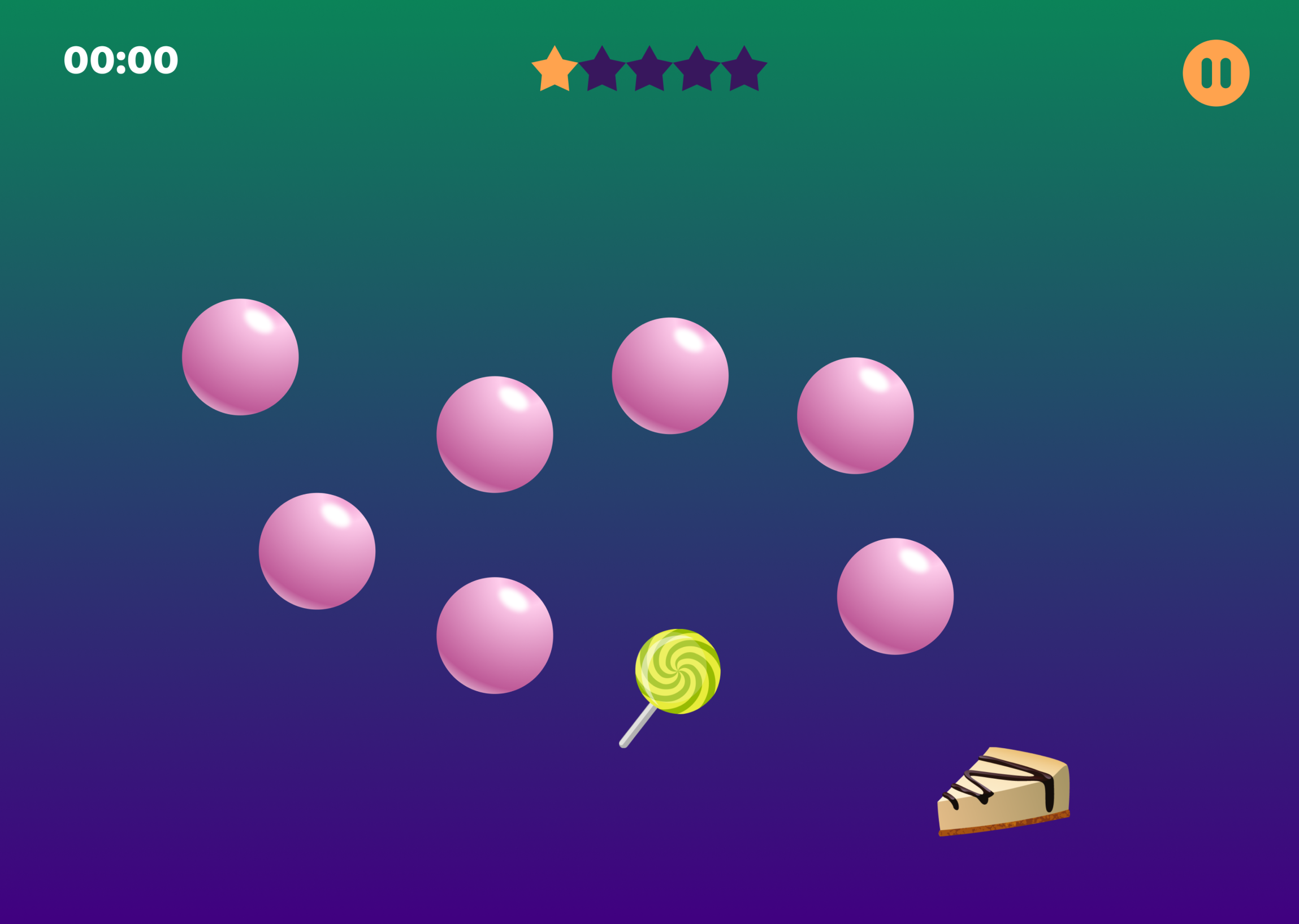
Rewards weren’t motivating enough. A star for every 5 minutes spent on the game increased the engagment.
TESTING
︎ User complaint
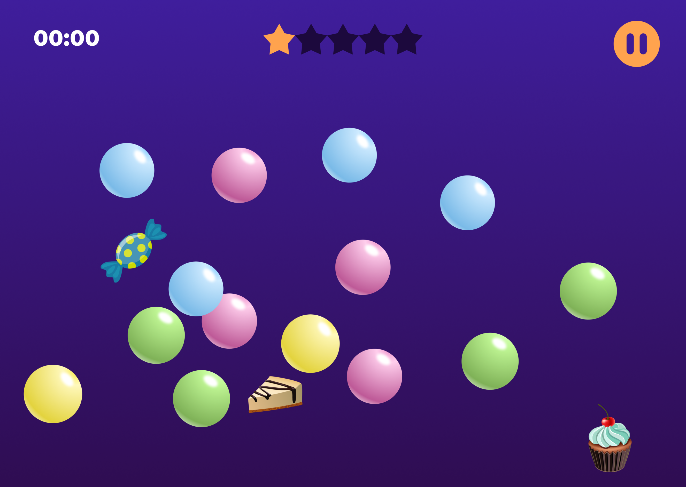
The Therapists informed that the kids weren’t able to distinguish the flat icon rewards from the bubbles, as both looked similar in the graphic style.
![]()
The Therapists informed that the kids weren’t able to distinguish the flat icon rewards from the bubbles, as both looked similar in the graphic style.

︎ Design Solution
Using 3d icons that mimic real objects were well received by kids, they were also easily disguishable from the bubbles.
![]()
Using 3d icons that mimic real objects were well received by kids, they were also easily disguishable from the bubbles.
︎ User complaint
Physical Therapists found it confusing to see all three parameters with sliding interactions. There is a lack of hierachy in the filters.
![]()
Physical Therapists found it confusing to see all three parameters with sliding interactions. There is a lack of hierachy in the filters.

︎ Design Solution
Switching the Level of the Game to clickable buttons established a hierarchy on the screen and reduced the cognitive load.
![]()
Switching the Level of the Game to clickable buttons established a hierarchy on the screen and reduced the cognitive load.

ACCESSIBILITY
Challenging part was to think not only of digital accessibility such as Color contrasts, Type sizes and Icons, but also of physical accessibility, the bottom part of the screen occupied with rewards and the top most inaccessible part of the screen reserved for use only by the Therapists with Play/Pause controls.

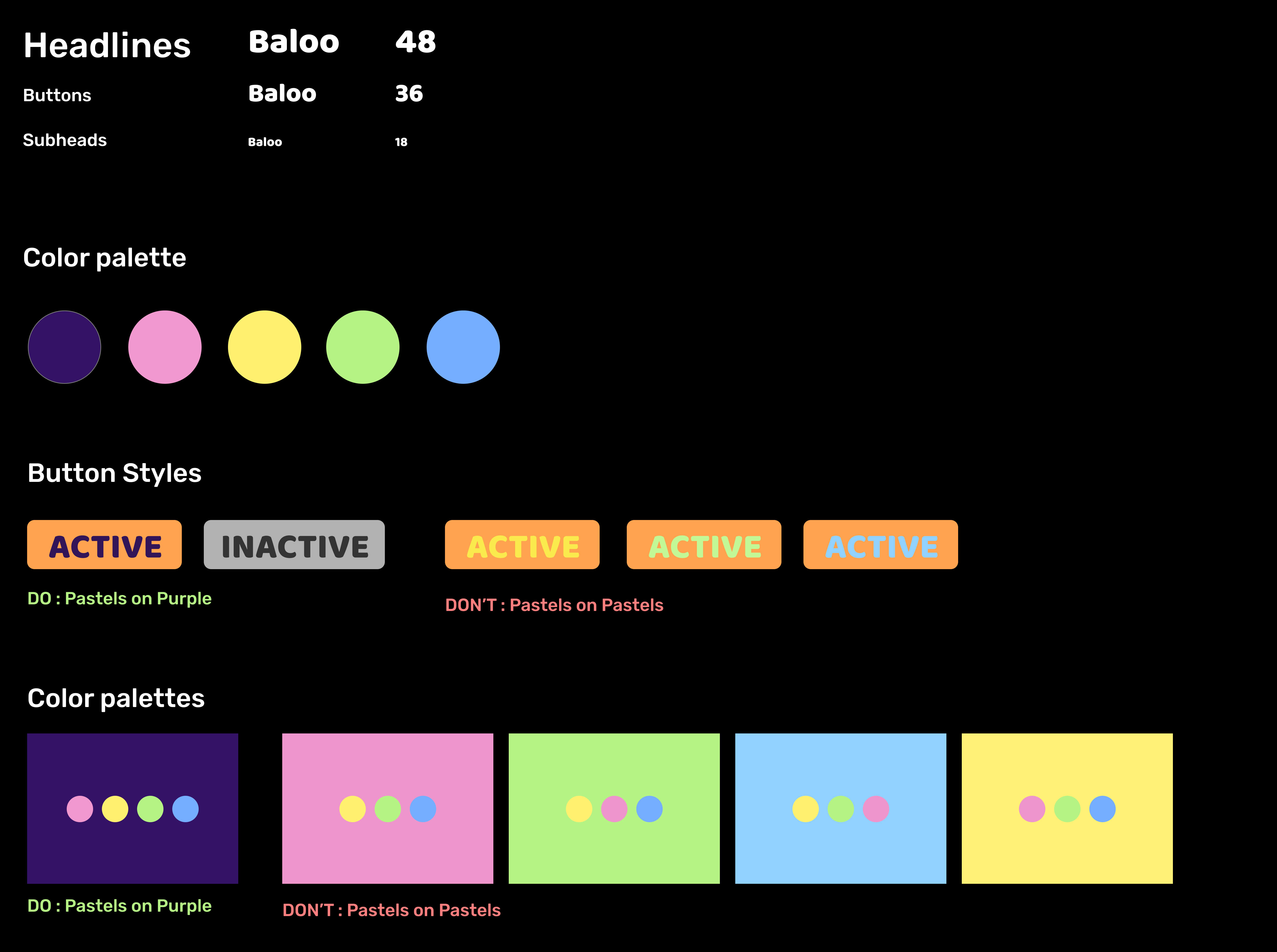
TYPE AND COLOR
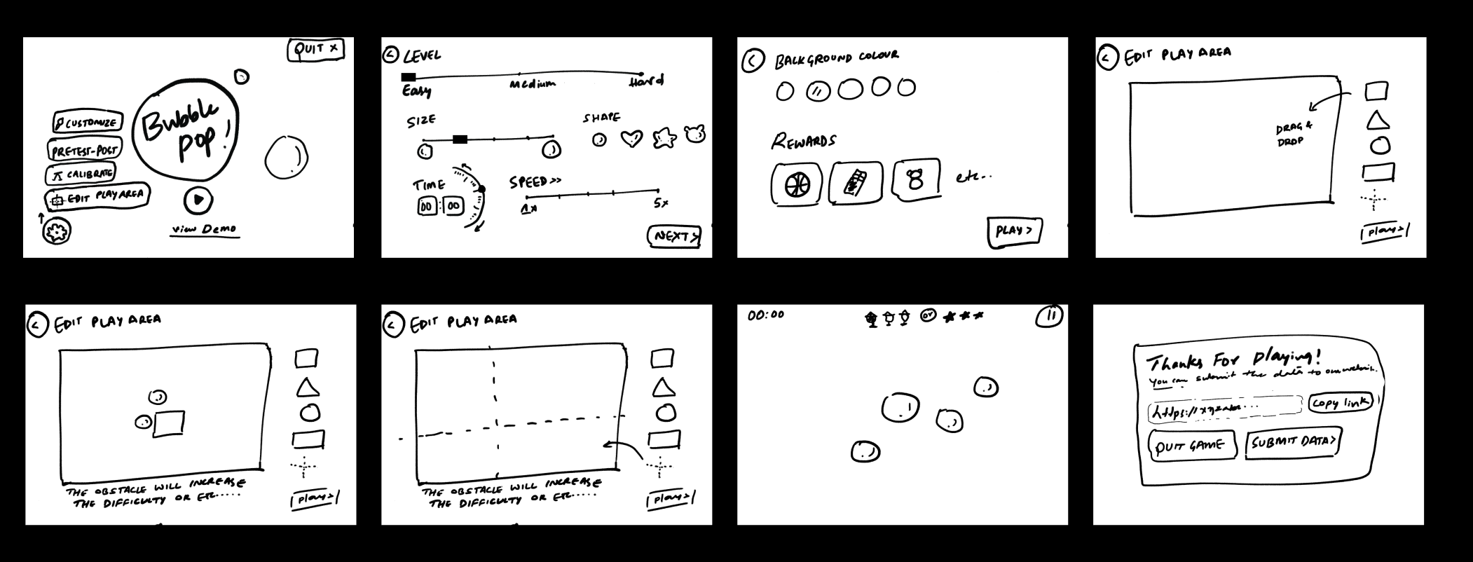
INITIAL SKETCHES![]()
