RENEWED END-TO-END SIGN UP FLOW AND AN AD-TIER FEATURE LAUNCH FROM DESIGN TO EXECUTION.
What started as a Business need to introduce an Ad-supported tier to AMC+ Streaming app, ended up being an opportunity to redesign the existing pruchase flow to a modular, intuitive and responsive one. Every Design decision was informed by User Testing and every round of iteration went through Stakeholder approvals.
👀️ CHECK IT OUT LIVE
IN MEDIA
🔗 Deadline
🔗 Hollywood Reporter
🔗 AMC Networks
☁️ INDIVIDUAL CONTRIBUTION
Lead Product Designer for the project, responsible for the User Flow and overall User Experience.
Hands-on Designer for Web and Mobile apps, Overseeing and supporting the Design for OTT
DURATION
8 months
LAUNCHED
Oct 23
Lead Product Designer for the project, responsible for the User Flow and overall User Experience.
Hands-on Designer for Web and Mobile apps, Overseeing and supporting the Design for OTT
DURATION
8 months
LAUNCHED
Oct 23
⛈️ TEAM
DESIGN
Hena Siddiqi, VP of Design
Anna Mott, Product Designer
ENGINEERING
Ryan Moore, Rob Franceschini, Web
Blaze Gawlik, Android
Yohann Taieb, Robert Lizardoi, iOS
PRODUCT MANAGEMENT
Paul Morello, Web
Brindon Sutton, iOS
Kavya Uppala, Android
DESIGN
Hena Siddiqi, VP of Design
Anna Mott, Product Designer
ENGINEERING
Ryan Moore, Rob Franceschini, Web
Blaze Gawlik, Android
Yohann Taieb, Robert Lizardoi, iOS
PRODUCT MANAGEMENT
Paul Morello, Web
Brindon Sutton, iOS
Kavya Uppala, Android
IMPACT
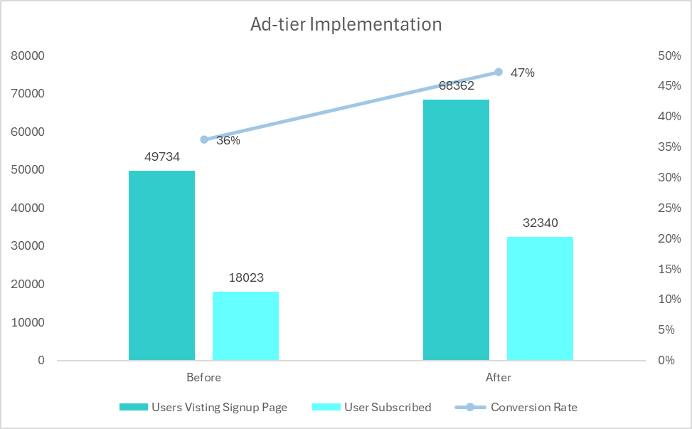
💎️ Conversion rate increased by 11% over the span of 3 months after Ad-tier purchase flow implementation. (i.e $345K in revenue)
💎️ On an average we saw an increase of 14k users monthly
💎️ This modular purchase flow designed using user research data helped us to scale it across other brands under AMCN, such as Acorn TV, saving manual hours put into redesign
💎️ Rebuilding the previously hard coded elements into CSS and CMS controlled components saved time in swapping promotions and deals.
WEB PURCHASE FLOW
In-market experienceCreate Account -> Plan Selection -> Checkout Info (via Stripe)
MOBILE PURCHASE FLOW
iOS +Android (In-market)Create Account -> Plan Selection -> Apple Pay/Google Pay
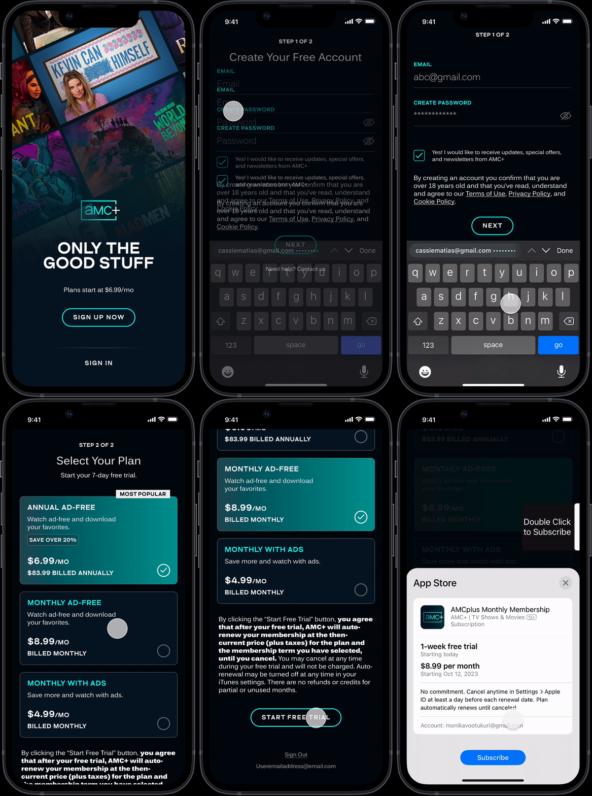
Further edits to surface the differences between Ad-Free and With Ads plans

Current

Edition 2.0
REDESIGN PROCESS - OLD VS NEW
THEN - STEP 2 (PLANS + PAYMENT INFO)
The step 2 was a single long column where the users had to scroll back and forth in order to see all the information
Since payment info is coupled with plan selection in the In-app purchase flow, any payment/card changes in the subscriber experience required a new screen with just payment info
Thin fonts for pricing and headers had legibility issues, especially on the bright teal background
![]()
The step 2 was a single long column where the users had to scroll back and forth in order to see all the information
Since payment info is coupled with plan selection in the In-app purchase flow, any payment/card changes in the subscriber experience required a new screen with just payment info
Thin fonts for pricing and headers had legibility issues, especially on the bright teal background

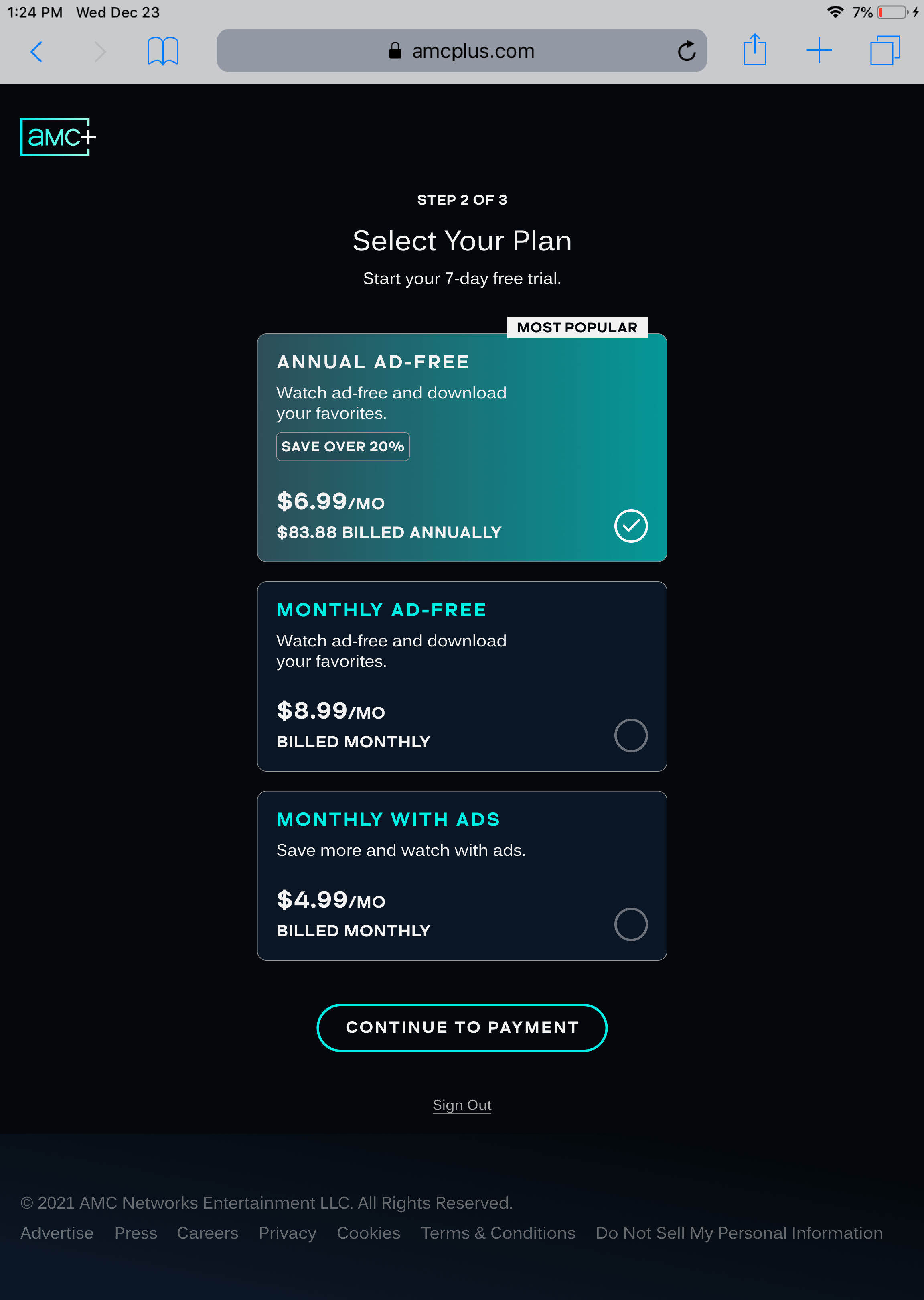
NOW - STEP 2 (PLANS) + STEP 3 (PAYMENT INFO)
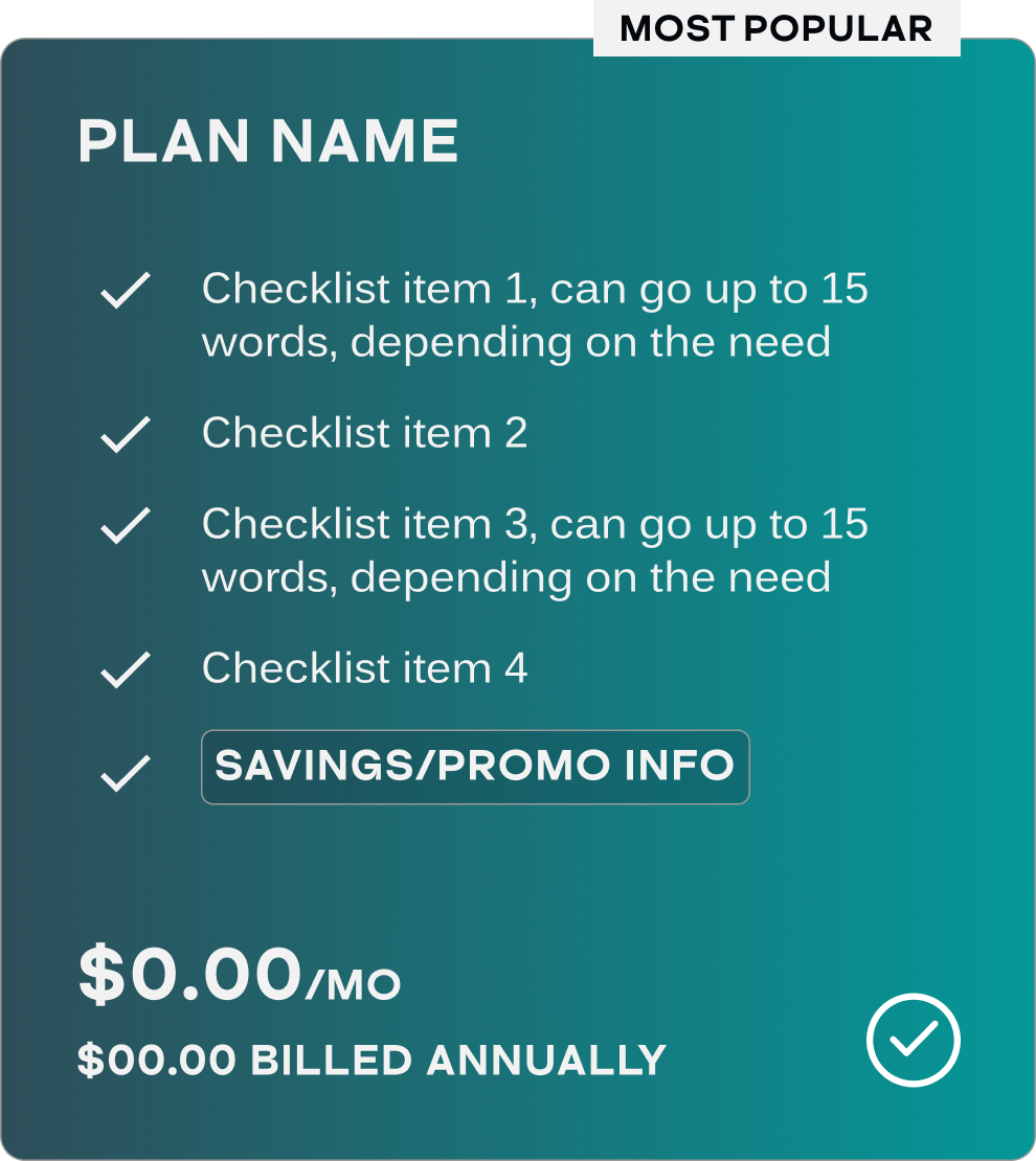
User Testing informed that users consider a checklist under each plan as transparent and informative. Hence the elaborate layout for plans.
To utilise space better, to avoid back and forth scrolling and to reduce development and design load for a new screen in payment changes, we spilt the step 2 into 2 different steps.
I used different fonts in the library and created a gradient from the brand colors that allows for legibilty without compromising on the brand identity.
![]()
![payment info]()
User Testing informed that users consider a checklist under each plan as transparent and informative. Hence the elaborate layout for plans.
To utilise space better, to avoid back and forth scrolling and to reduce development and design load for a new screen in payment changes, we spilt the step 2 into 2 different steps.
I used different fonts in the library and created a gradient from the brand colors that allows for legibilty without compromising on the brand identity.


SCALABILITY FOR DEVICES
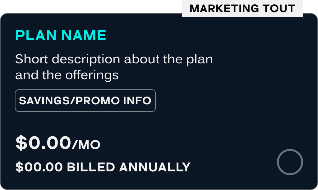
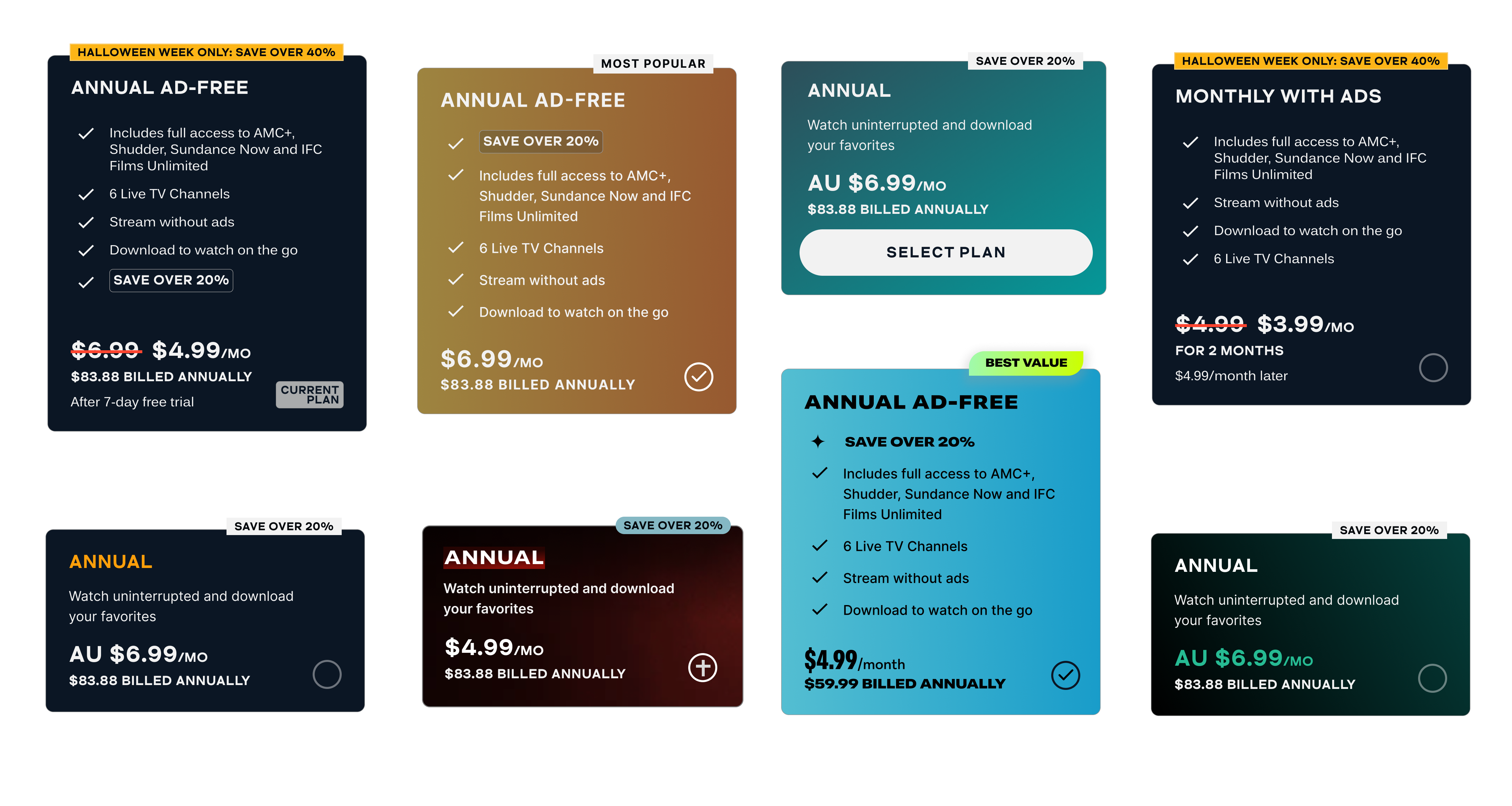
As device size shrinks, the annual plan in the center of the desktop layout becomes the top most plan in mobile/tablet layout to maintain the same prominence.
Although users preferred a checklist on Desktop, they preferred to see less information on the mobile layout.


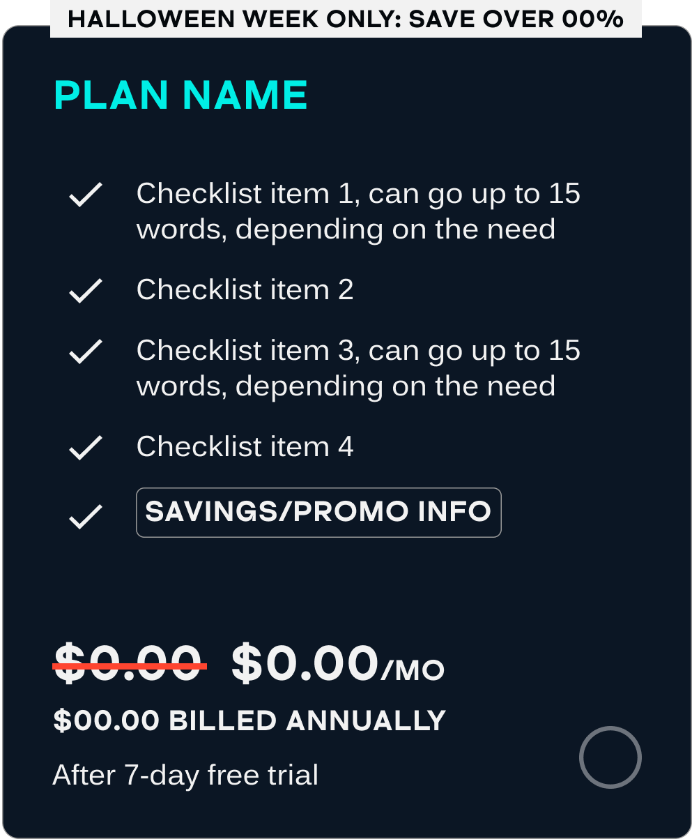
SCALABILITY FOR BRANDS, USER STATES, BUSINESS SCENARIOS
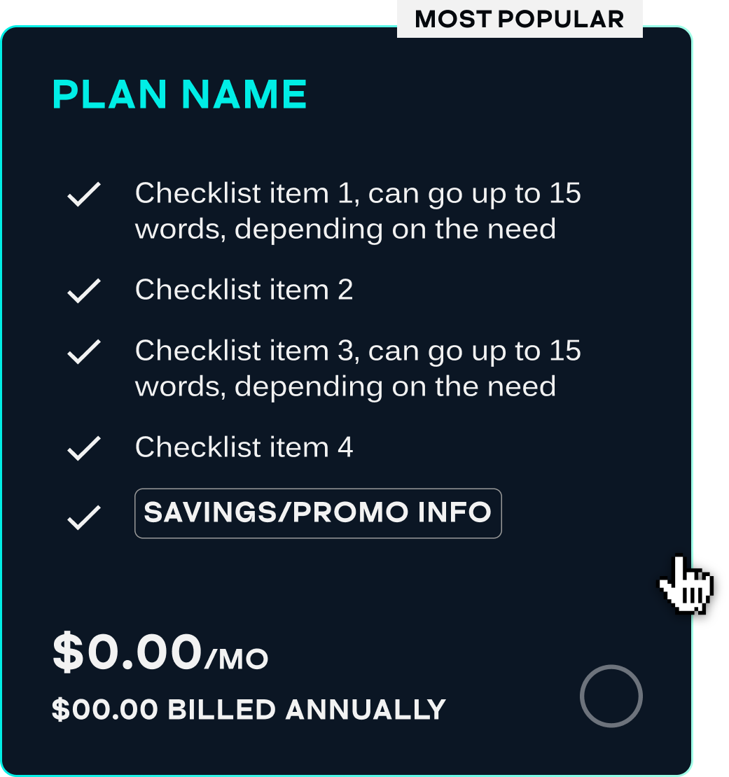
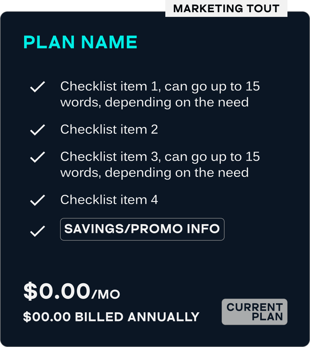
Designing not just for device scalability, but also for various user states such as hover or selected, and various business situations such as promotions, international markets and upgrade/downgrade flows.


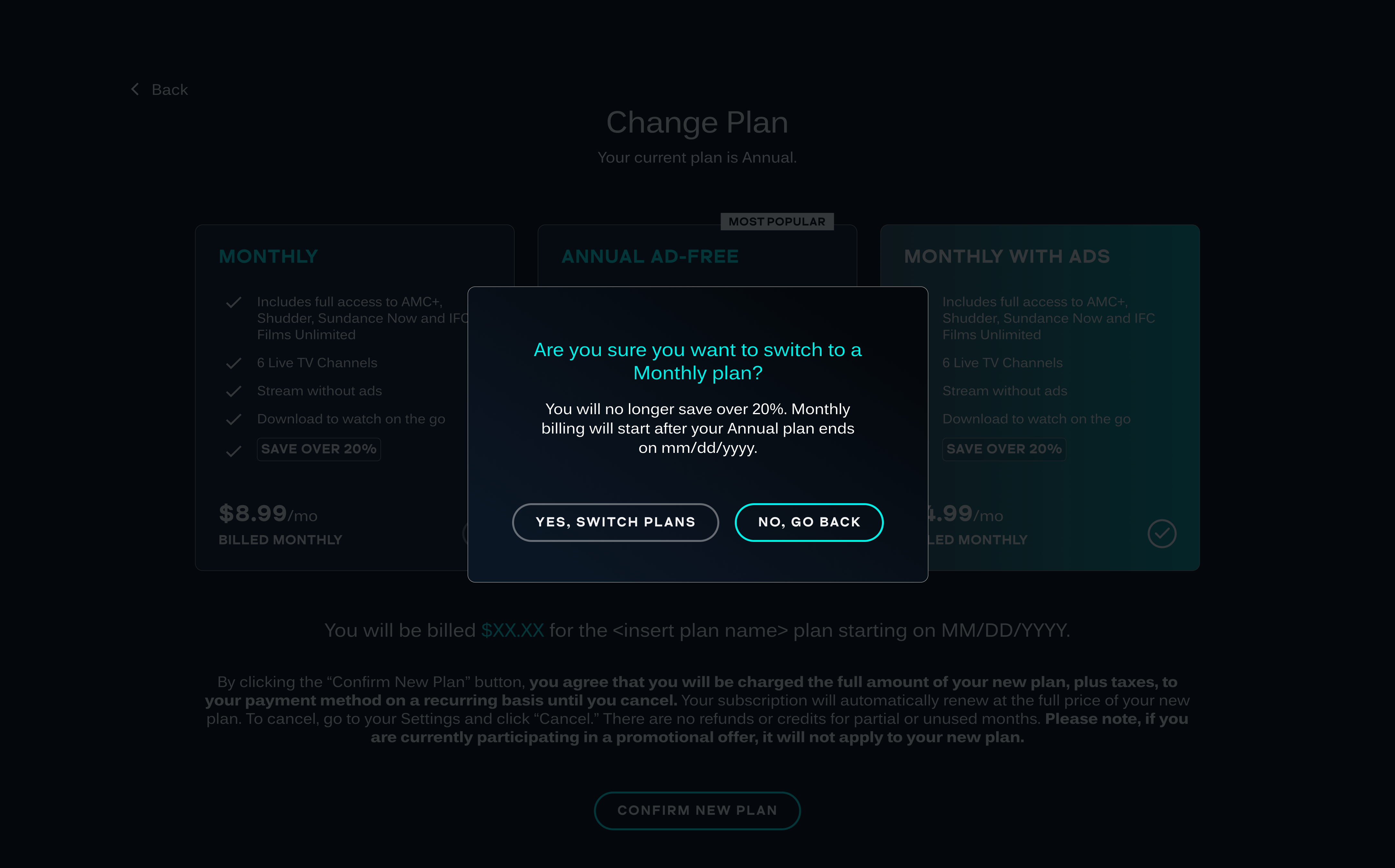
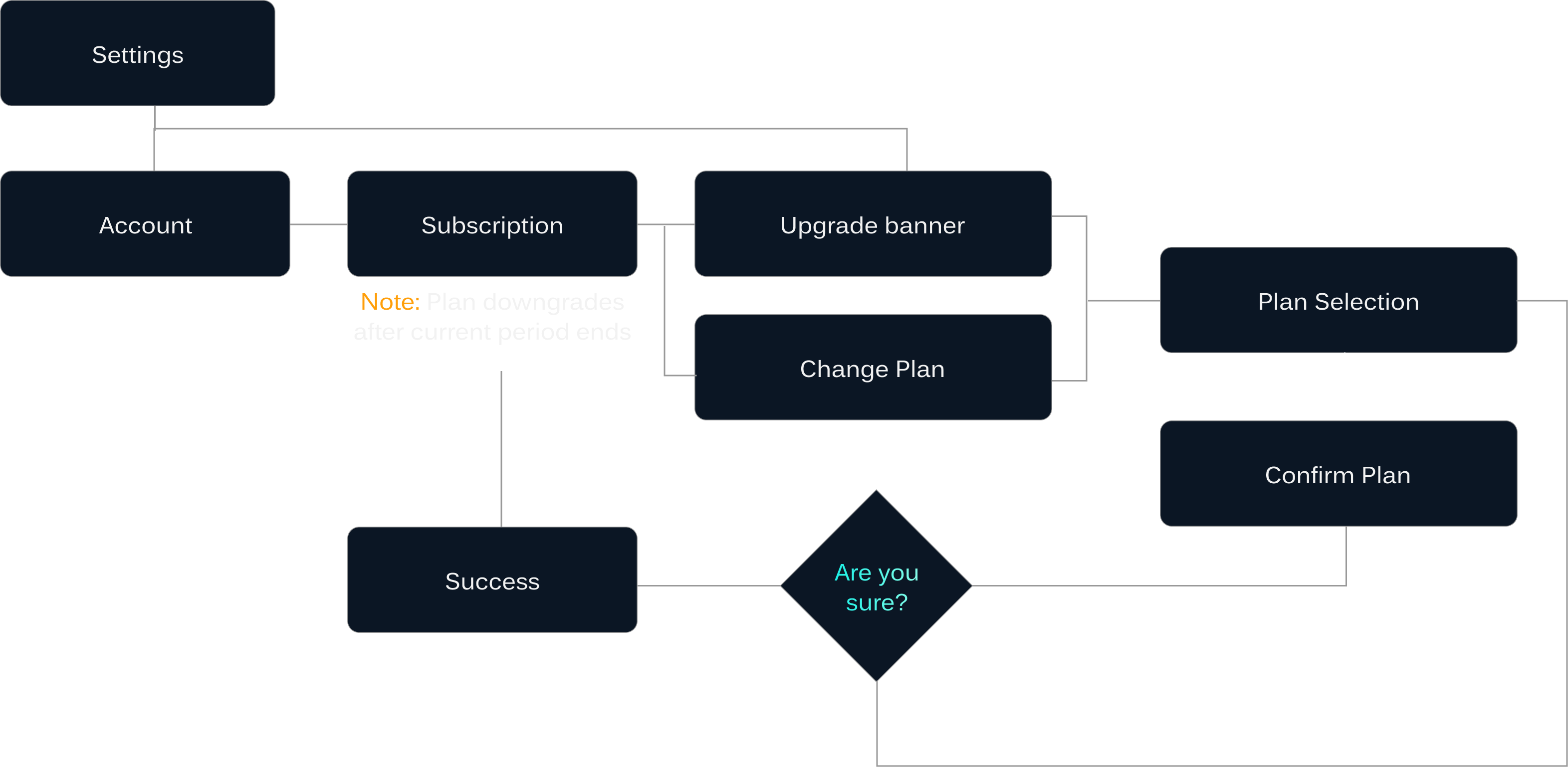
UPGRADE AND DOWNGRADE ON WEB
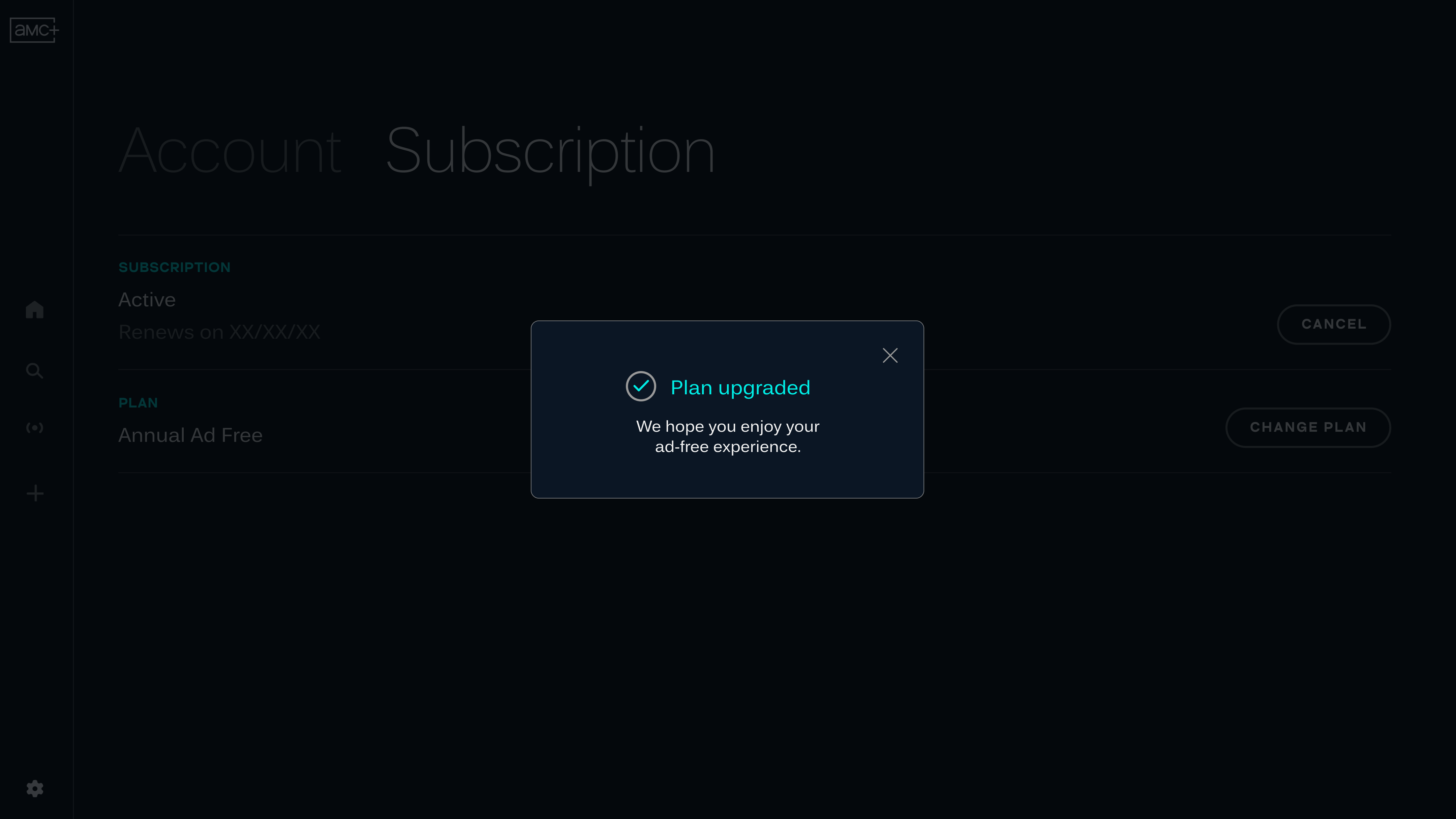
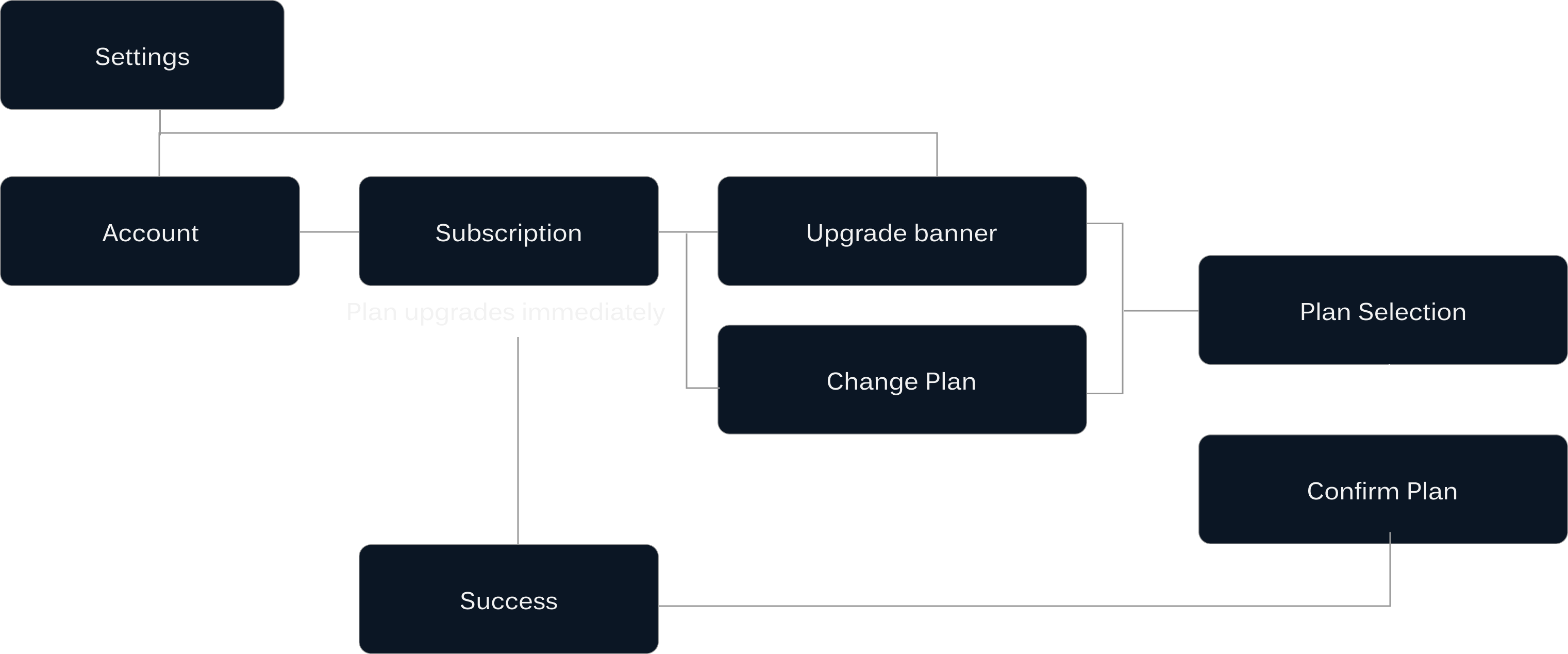
Utilising the plan selection screen from the in-app purchase flow, pre-selecting the current plan instead of the Annual plan, the upgrade and downgrade flows differ slightly in the messaging

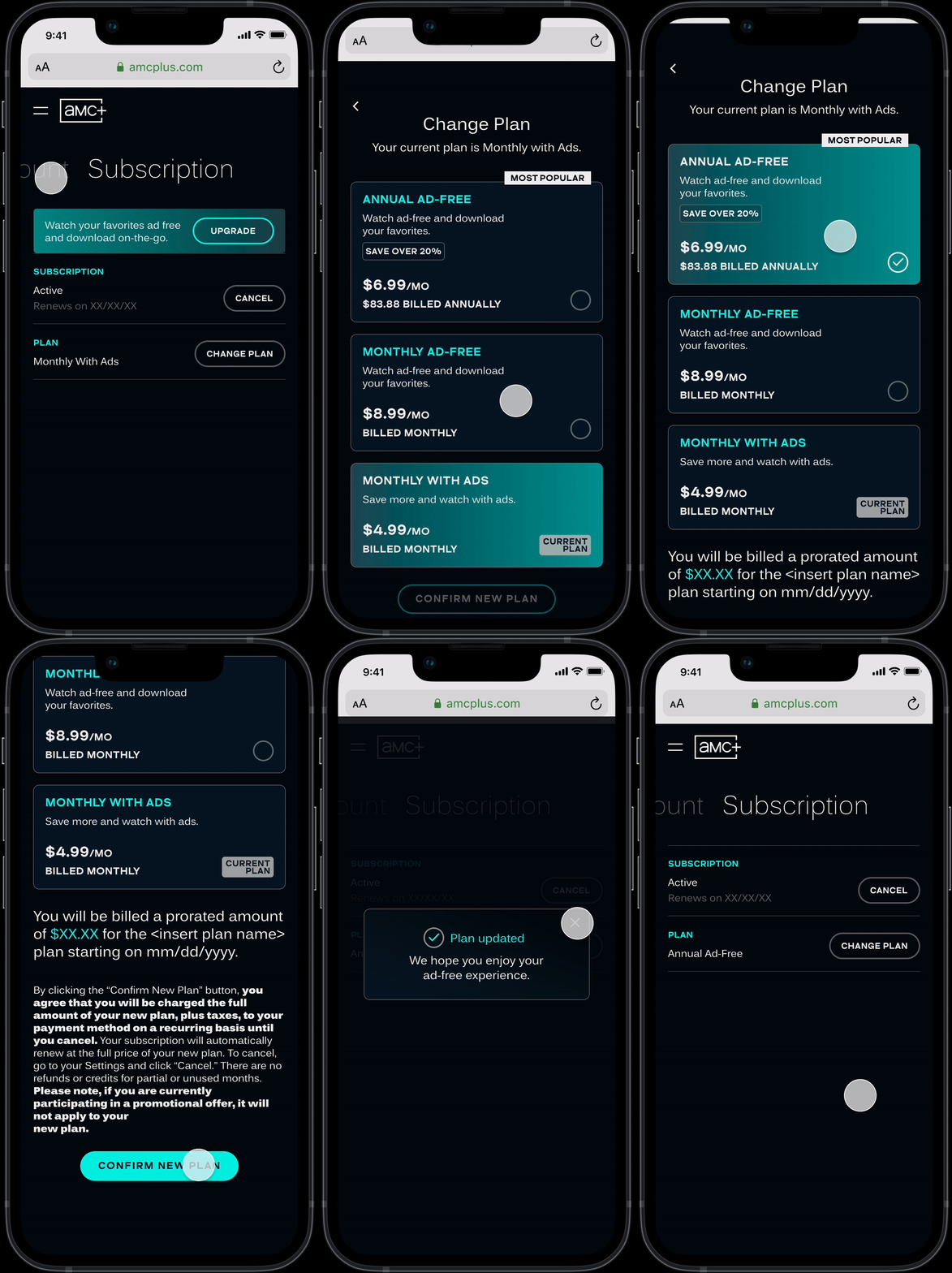
PLAN UPGRADE
![]()
![]()
PLAN DOWNGRADE
REFLECTION AND TAKEAWAYS
Engineering and Design coordination goes a long way! Developers and Product Managers help bring the approved Designs to life.
Push for those minor Design fixes - type, space, color and interactions are just as important as the user flow
Leverage User Testing and Competitive Analysis to validate and toexpress your ideas
Test the builds, mark the bugs, every single bug counts!
